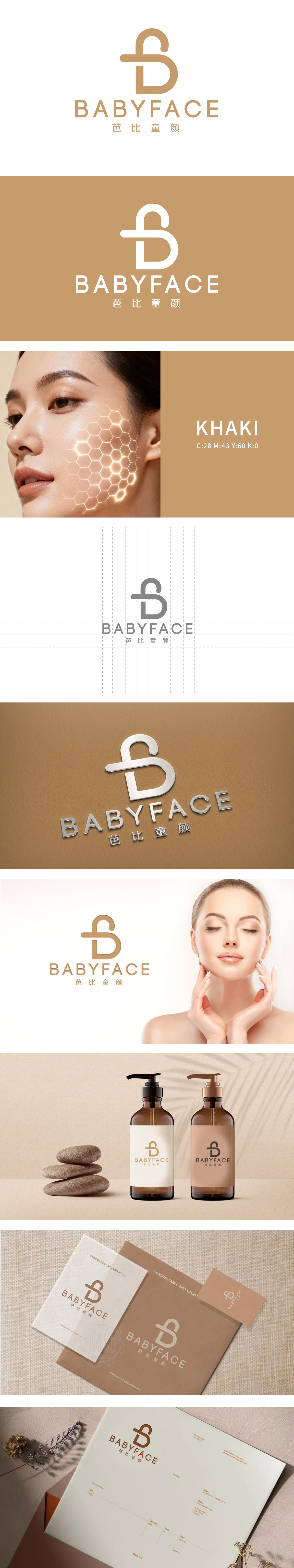
狮动设计以字母“B”变形而来,整体呈现 圆润、柔和的曲线形态:既像女性柔美的轮廓,又暗合“童颜”所象征的饱满、紧致的肌肤状态,视觉上传递出“温和、呵护”的美容属性,贴近日化/美容行业追求的“亲和力”与“舒适感”。正负形巧思:图形中嵌入的“+”号,而是自然融入“B”的结构中,形成“一体成型”的视觉效果,既象征“美容技术与自然童颜的融合”,也暗含“加法”——为用户带来肌肤状态的正向提升,传递品牌“专业赋能美丽”的理念。色彩选择:暖棕色系作为主色调,符合“童颜”的自然、纯净感,同时传递出 高端、雅致的日化品牌定位。
Lion design is transformed from the letter "B", showing a rounded and soft curve shape as a whole:
It is not only like the feminine outline of women, but also coincides with the full and tight skin state symbolized by "childlike face", which visually conveys the beauty attribute of "gentleness and care" and is close to the "affinity" and "comfort" pursued by the daily chemical/beauty industry. Ingenious thinking of positive and negative shapes: the "+"sign embedded in the figure is naturally integrated into the structure of "B", forming an "integrated" visual effect, which not only symbolizes "the integration of beauty technology and natural beauty.


扫码或拨打添加客服微信


