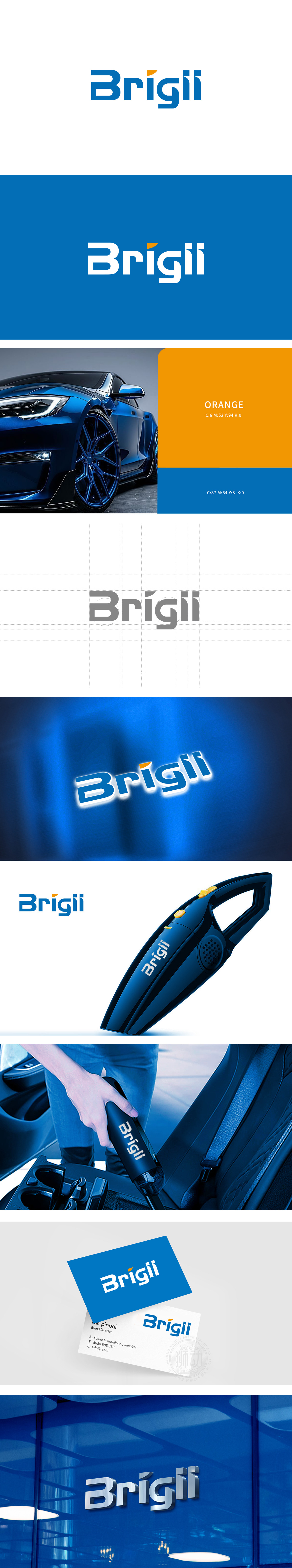
狮动设计采用无衬线体为基础,字形饱满且线条流畅,如“B”的圆润弧度、“g”的柔和曲线,圆润的字体线条可联想产品的“流线型机身”,而“g”字母的下弯钩设计,甚至暗合产品“吸附”的动态感,视觉上传递“高效清洁”的功能联想。字母“i”上方的橙色圆点打破纯蓝色调的单调,像一颗灵动的“亮点”,既呼应品牌名“Brigli”,又在视觉上形成记忆点。主色调:蓝色——传递科技感、可靠性与专业度,符合汽车用品对“高效”“安全”的用户心理预期;橙色——注入活力与温暖,平衡蓝色的冷静感,整体以“功能隐喻+用户体验”为核心:通过字体的柔和线条、色彩的情感化搭配,将汽车产品的“科技感”“转化为直观的视觉语言。
Lion design is based on sans serif, with full fonts and smooth lines, such as the rounded radian of "B" and the soft curve of "G". The rounded font lines can be associated with the "streamlined body" of the product, while the downward hook design of the letter "G" even coincides with the dynamic sense of "adsorption" of the product, visually conveying the functional association of "efficient cleaning". The orange dot above the letter "I" breaks the monotony of pure blue tone, like a smart "bright spot", which not only echoes the brand name "Brigli", but also forms a memory point visually. Main color: blue-conveys the sense of science and technology, reliability and professionalism, which is in line with the psychological expectation of automobile accessories for "efficiency" and "safety".


扫码或拨打添加客服微信


