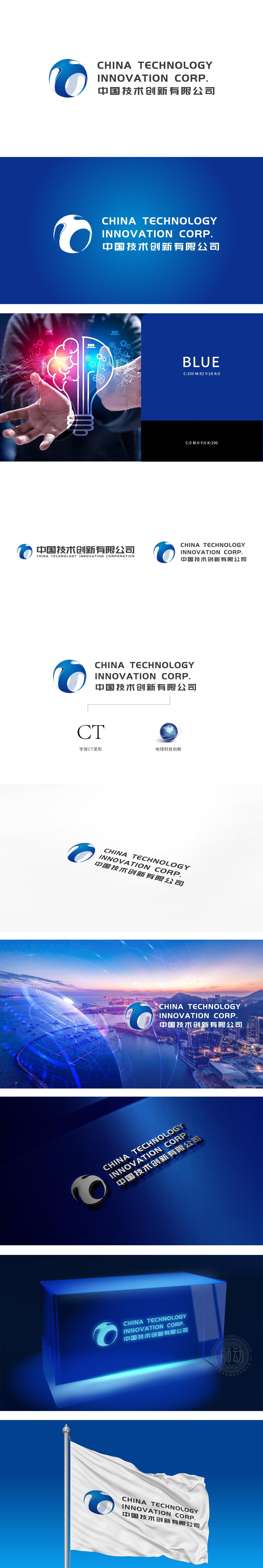
狮动设计以蓝色地球元素,巧妙勾勒出“CT”的变形结构——蓝色色块形似“C”的环抱,白色留白与蓝色渐变形成“T”的挺拔,整体如旋转的星球轨迹,既呼应“科技”的动态感,又暗藏品牌核心“CT”基因,实现了“图形即字母”的高度凝练。蓝白配色经典且专业,蓝色象征科技、信任与深度,白色增强通透感,符合科技企业的理性气质。每个图形、色彩、文字都服务于“科技”“创新”“全球化”“CT基因”四大关键词,既符合科技企业严谨、可靠的调性,又通过动态线条和星球意象避免了传统科技品牌的刻板印象,展现出“理性中蕴含活力”的气质。
Lion design uses blue earth elements to skillfully outline the deformation structure of CT —— the blue color block is surrounded by a C, the white space and the blue gradient form a T, and the whole is like a rotating planet trajectory, which not only echoes the dynamic sense of "technology" but also hides the brand core "CT" gene, realizing the high conciseness of "graphics are letters". Blue and white color matching is classic and professional, blue symbolizes technology, trust and depth, and white enhances transparency, which conforms to the rational temperament of technology enterprises.Each figure, color and text serves the four key words of science and technology.


扫码或拨打添加客服微信


