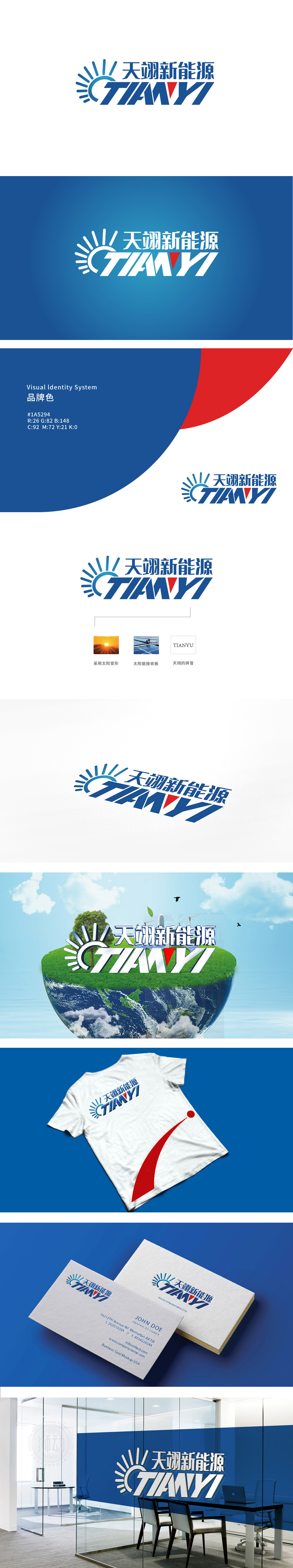
狮动设计用蓝色放射状线条+半圆构成“简化太阳”,既是新能源的核心符号,又通过“放射状”形态传递“能量释放”的动态感,暗示企业“提供清洁能源”的价值。“太阳”与“TIANYI”的“T”形成视觉联动,将品牌太阳能转化为可利用的能量,让“抽象的新能源”变得可感知,主色调采用科技蓝代表专业、环保、冷静,符合新能源企业“科技感+责任感”的形象;“Y”字母中的红色三角形作为点缀,像一把“能量钥匙”,既打破蓝色的单调,又传递“创新、突破”的企业精神(红色象征热情与动力),成为整个logo的“视觉焦点”,让人过目难忘。
Lion design uses blue radial lines and semicircles to form "simplified sun", which is not only the core symbol of new energy, but also conveys the dynamic sense of "energy release" through the "radial" form, suggesting the value of "providing clean energy" for enterprises. "Sun" and "T" of "TIANYI" form a visual linkage, which will make the brand Solar energy is converted into usable energy, which makes "abstract new energy" perceptible. The main color adopts technology blue to represent professionalism, environmental protection and calmness.


扫码或拨打添加客服微信


