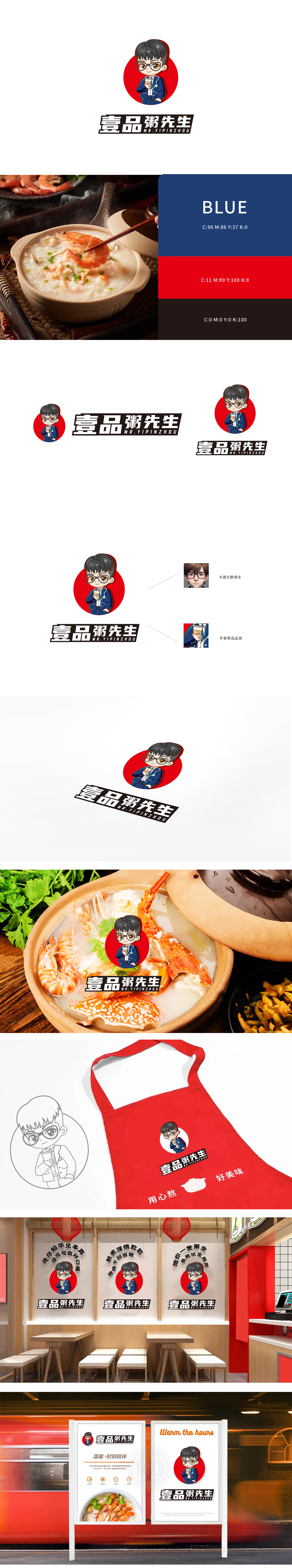
狮动设计采用“文静男生”设定,黑框眼镜搭配深蓝色制服,既有书卷气的“先生”儒雅感,又通过微微笑眼和温和神态拉近与消费者的距离,人物手持粥品的动态,直观传递产品核心,制服上的徽章、纽扣等元素增强了品牌的精致感,传递“用心做好每一碗粥”的品牌理念,信任感油然而生。红色圆形背景作为主视觉符号,既吸睛又传递温暖、热情的餐饮属性;深蓝色制服与白色内搭形成经典配色,平衡了红色的跳跃感,整体色调沉稳且不失活力。设计不仅精准捕捉了“粥先生”的品牌人格(专业、亲切、健康),更通过视觉符号的逻辑串联,赋予品牌温度感。
Lion design adopts the setting of "quiet boy", black-rimmed glasses and dark blue uniforms, which not only has the elegant sense of "Mr.", but also draws closer to consumers through a slight smile and gentle manner. The characters hold the dynamics of porridge and intuitively convey the core of the product. The badges, buttons and other elements on the uniform enhance the brand's exquisite feeling and convey the brand concept of "making every bowl of porridge with heart", and the sense of trust arises spontaneously. As the main visual symbol, the red round background not only attracts eyes but also conveys warm and enthusiastic dining attributes; The dark blue uniform and the white lining form a classic color scheme, which balances the jumping feeling of red, and the overall tone is calm and energetic.


扫码或拨打添加客服微信


