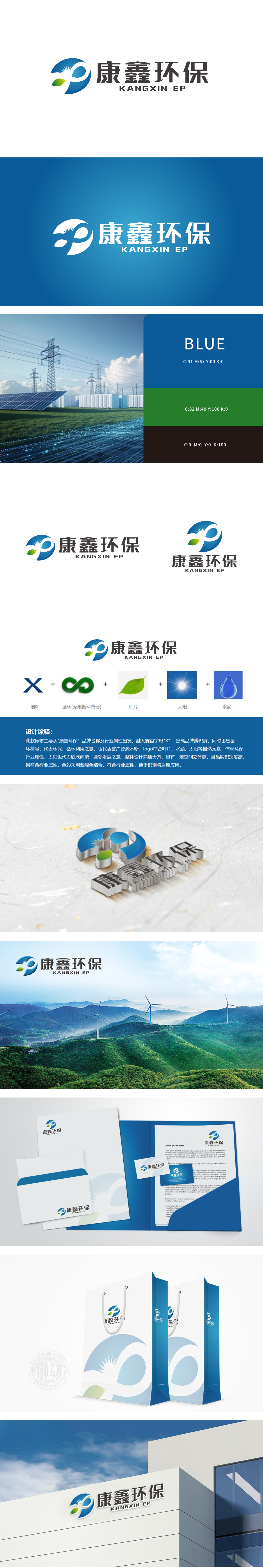
狮动设计采用首字母“X”为视觉起点,将其与无限循环符号(∞)巧妙结合,传递“环保循环利用”的核心价值,同时暗喻客户资源与业务的可持续发展(“源源不断”)。叶片(象征生命与绿色生态)、太阳(代表能量、活力与可持续发展)、水滴(对应环保领域核心的水资源保护),让观者联想到“自然、生态、可持续”,符合环保品牌“传递绿色价值”的沟通需求。主色调采用蓝绿渐变,蓝色象征水与科技感,绿色代表自然与环保,二者结合既符合行业属性,又传递出“专业、可靠、亲和”的品牌气质。整体线条流畅,循环符号的动态感与叶片、水滴的静态质感形成平衡,简洁大方的设计增强了空间立体感。
Lion design uses the initial "X" as the visual starting point, and skillfully combines it with the infinite cycle symbol (∞) to convey the core value of "environmental recycling", and at the same time, it implies the sustainable development of customer resources and business ("continuous flow"). Leaves (symbolizing life and green ecology), sun (representing energy, vitality and sustainable development) and water droplets (corresponding to the core water resources protection in the field of environmental protection) remind viewers of "nature, ecology and sustainability" and meet the communication needs of environmental protection brands to "convey green value". The main color is gradually changed from blue to green. Blue symbolizes water and technology.


扫码或拨打添加客服微信


