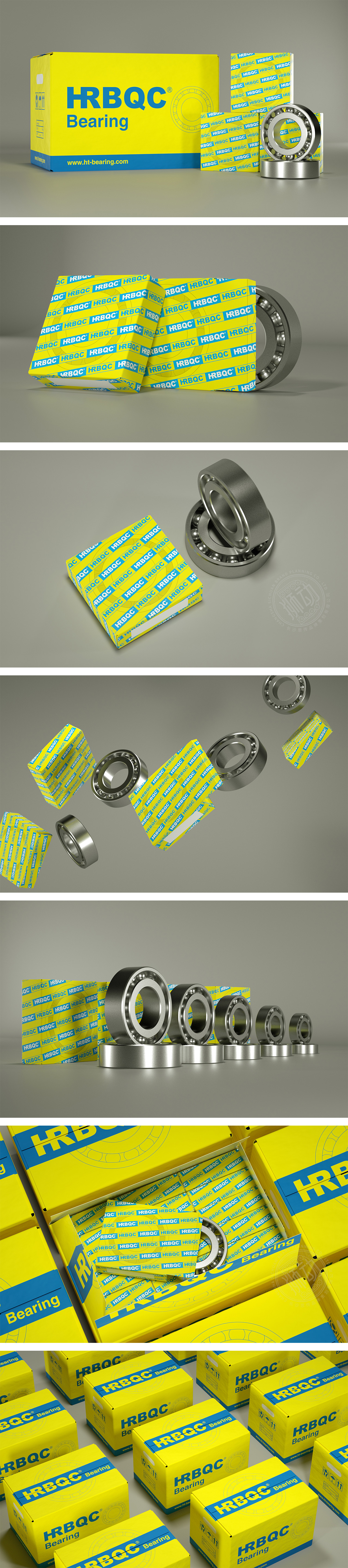
狮动设计主包装盒以轴承结构线条图,用黄色细线条勾勒轴承剖面图,既呼应产品属性,又通过抽象图形增强设计感,大面积明黄色作为基底,搭配蓝色品牌标识与文字,形成高对比度的撞色组合。黄色在工业领域中常与“可靠、高效”关联,且视觉穿透力强,能快速吸引注意力;蓝色则传递“专业、精密”的技术属性,两者搭配既符合机械产品的行业调性,又避免了传统工业包装的沉闷感。整体设计既用鲜明的视觉语言构建了“HRBQC”的品牌记忆点,又通过细节处理传递出轴承产品“精密、可靠”的核心价值,实现了工业产品包装中“功能性”与“品牌表现力”的高效平衡,展现出对商业需求与设计美学的深刻理解。
Lion design uses the main packaging box to draw the bearing structure line drawing, and outlines the bearing section drawing with thin yellow lines, which not only echoes the product attributes, but also enhances the design sense through abstract graphics. A large area of bright yellow is used as the base, and blue brand logos and characters are matched to form a high-contrast color combination. Yellow is often associated with "reliability and efficiency" in the industrial field, and it has strong visual penetration and can quickly attract attention; Blue conveys the technical attributes of "professionalism and precision". The combination of the two not only conforms to the industrial tonality of mechanical products, but also avoids the dull feeling of traditional industrial packaging.


扫码或拨打添加客服微信


