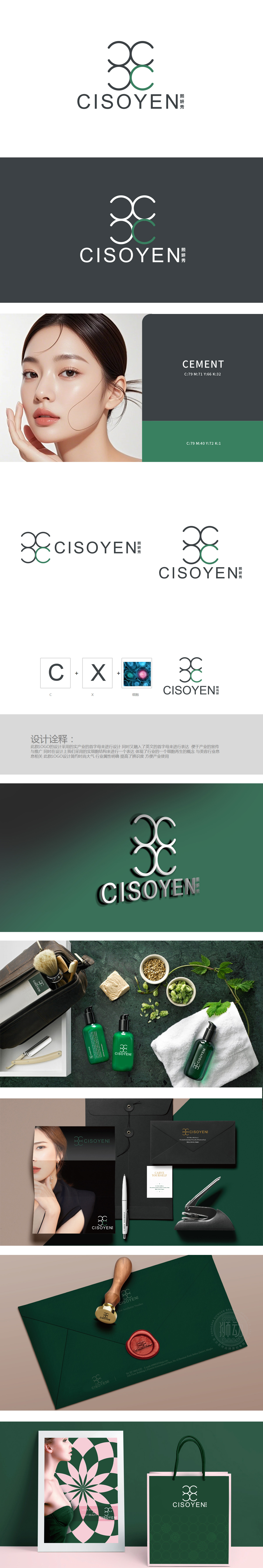
狮动设计以“C”“X”字母为基础框架,叠加微观细胞图像,直观传递“CX”与“细胞”的核心概念,与美容行业的“细胞再生”“科技护肤”属性高度契合。黑色线条构成的循环交错形态,既像细胞分裂的动态轨迹,又暗含“科技赋能”的精密感;绿色“C”的点睛之笔,则注入了自然、生机的意象,平衡了科技的冷感,符合美容行业对“自然科技”的双重诉求。整体设计采用极简线条、几何切割与低饱和色调(黑+灰+绿),呈现出简约大气的国际化风格,符合高端美容品牌的调性。
Lion Design is based on the letters "C" and "X", with microscopic cell images superimposed to convey the core concepts of "C”“X" and "cell" intuitively, which is highly compatible with the attributes of "cell regeneration" and "scientific skin care" in the beauty industry. The circular crisscross pattern composed of black lines is not only like the dynamic trajectory of cell division, but also implies the sense of precision of "technology empowerment"; The finishing touch of green "C" injects the images of nature and vitality, balances the coldness of science and technology, and accords with the dual demands of beauty industry for "natural science and technology".


扫码或拨打添加客服微信


