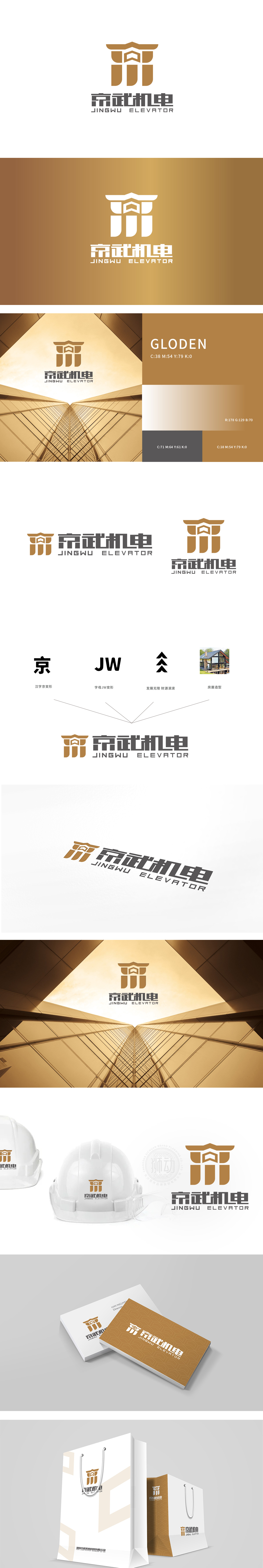
狮动设计以汉字变形“京”:以方正挺拔的书法笔触为基础,保留“京”字的识别性,同时通过线条简化增强现代感,传递品牌的本土化根基与稳重气质。字母“JW”变形:将品牌首字母“J”“W”进行结构重组,线条刚柔并济,既呼应汉字的笔画韵律,又体现国际化视野,实现中英文视觉语言的统一。向上的箭头与叠加的三角形组合,形成“步步高升”的动态意象,三角形的稳定性与箭头的冲击力结合,既象征企业的稳健发展,又暗含行业属性中的“机械结构感”(如齿轮、支架的几何美感)。通过具象化元素强化品牌与“空间、建筑”的关联,增强用户认知,,将品牌的“本土化+国际化”“传统+现代”“精密制造+持续发展”等核心价值,转化为直观可感的视觉语言。
Lion design is based on the deformation of Chinese characters "Jing": based on the upright calligraphy strokes, it retains the recognition of the word "Jing", and at the same time enhances the sense of modernity through line simplification, conveying the localization foundation and stable temperament of the brand. The letter "J”“W" is deformed: the brand initials "J" and "W" are restructured, and the lines are both rigid and flexible, which not only echoes the stroke rhythm of Chinese characters, but also reflects the international vision and realizes the unification of Chinese and English visual languages. The combination of the upward arrow and the superimposed triangle forms a dynamic image of "rising step by step". The combination of the stability of the triangle and the impact of the arrow not only symbolizes the steady development of the enterprise.


扫码或拨打添加客服微信


