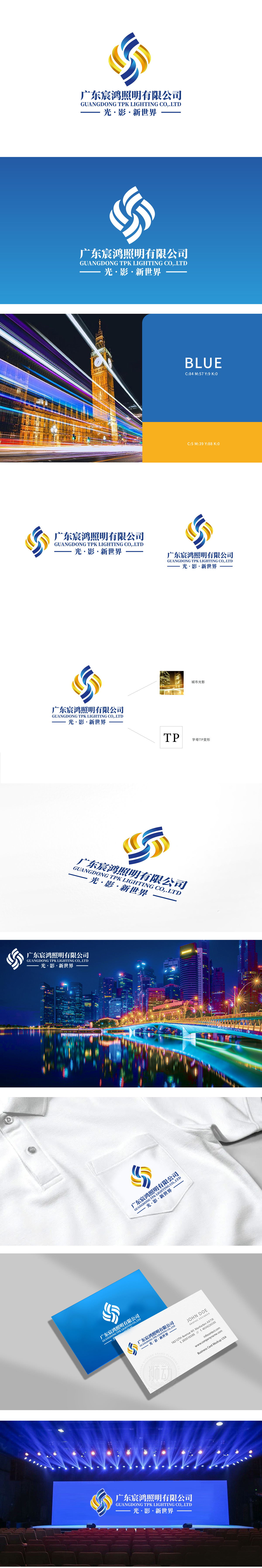
狮动设计采用蓝黄渐变的流线型螺旋结构,既像旋转的光束交织,又似抽象化的“TP”字母变形。蓝色代表科技与专业,黄色象征光芒与活力,两种色彩通过渐变自然过渡,直观传递“照明”行业属性,同时螺旋向上的动态感赋予图形“光的流动与扩散”意象,打破静态设计的沉闷。整体设计从“光影的本质——流动、交织、塑造空间”切入,用抽象图形承载行业特性,用场景化元素传递价值主张,最终让品牌形象既具科技感与专业性,又充满艺术张力。
Lion design adopts a streamlined spiral structure with gradual blue and yellow changes, which is both like the interweaving of rotating beams and the deformation of abstract "TP" letters. Blue represents science and technology and specialty, and yellow symbolizes light and vitality. The two colors naturally transition through gradual changes, intuitively conveying the industrial attributes of "lighting", and at the same time, the spiral dynamic sense endows graphics with the image of "light flow and diffusion", breaking the dullness of static design. The overall design starts from "the essence of light and shadow-flowing, interweaving and shaping space".


扫码或拨打添加客服微信


