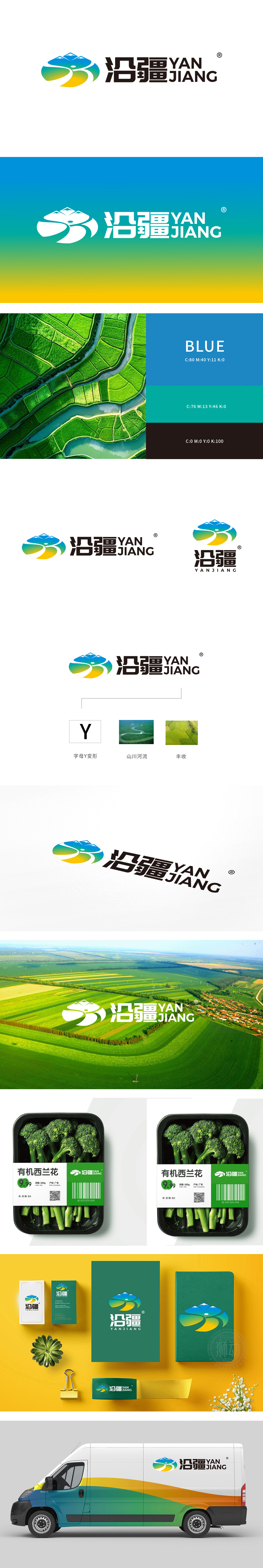
狮动设计以字母“Y”变形,线条流畅地勾勒出山川轮廓(与蜿蜒河流,既象征沿疆地区的地理特征,又通过色彩渐变,传递自然生态与农业生机——蓝色代表水源,绿色象征植被/农田,黄色暗喻丰收,形成“自然环境→农业生产→丰收成果”的逻辑闭环。整体设计构建了“地域特色(沿疆)→自然禀赋(山川河流)→农业生产(生态种植)→丰收成果”的完整叙事链,突显专注于地域特色农产品或生态农业服务,传递“源于自然、精于品质”的核心价值。
Lion esign is deformed by the letter "Y", and the lines smoothly outline the outline of mountains and rivers (and winding rivers, which not only symbolize the geographical characteristics of the areas along the Xinjiang, but also convey the natural ecology and agricultural vitality through color gradient-blue represents water source, green symbolizes vegetation/farmland, and yellow symbolizes bumper harvest, forming a logical closed loop of "natural environment → agricultural production → bumper harvest results". global designA complete narrative chain of "regional characteristics (along Xinjiang) → natural endowments (mountains and rivers) → agricultural production (ecological planting) → harvest results" has been constructed.


扫码或拨打添加客服微信


