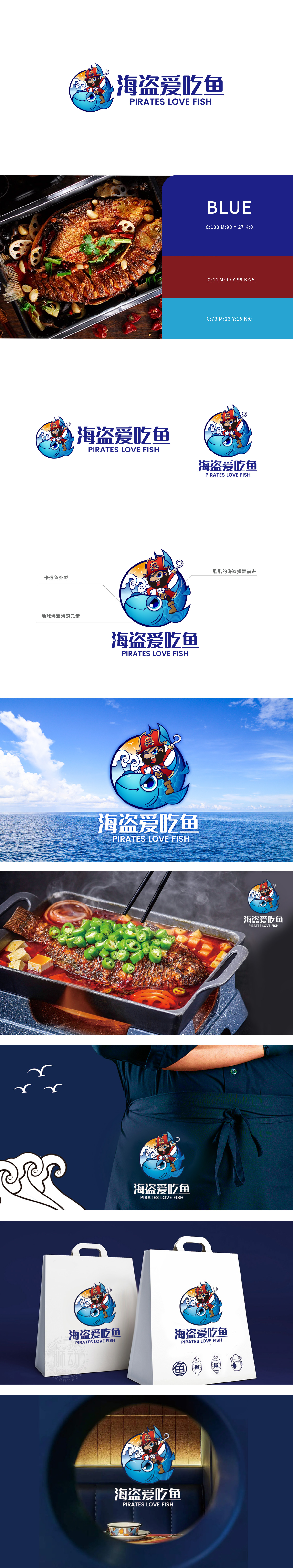
狮动设计用“海盗+鱼”构建差异化记忆点,角色IP化设计——海盗形象的情感连接,卡通海盗形象打破了传统餐饮品牌的刻板印象,通过“冒险、热情、不拘小节”的性格标签,传递出品牌“新鲜、活泼、有故事感”的调性,其“挥舞钩子向前”的动态姿态,既强化了视觉张力,又隐喻品牌积极进取的态度,赋予LOGO人格化魅力。主体“蓝色大鱼”以拟人化设计,突出“美味、友好”的餐饮联想;鱼身与圆形地球轮廓融合,既强化“海洋”场景属性,又暗示食材来源的广阔与新鲜,视觉上形成“鱼跃出海”的生动画面,让“吃鱼”这一核心业务一目了然。LOGO通过“地球轮廓+海浪+海鸥+落日”的背景组合,构建了完整的“海盗航海寻鱼”场景:形成“冒险寻鲜,美味归来”的故事联想,让消费者在看到LOGO时自动代入“探索美食”的情境。
Lion design uses "pirates+fish" to build differentiated memory points, and the IP design of roles-the emotional connection of pirate images. Cartoon pirate images break the stereotype of traditional catering brands, and convey the brand's tonality of "freshness, liveliness and story sense" through the personality label of "adventure, enthusiasm and informality". Its dynamic posture of "waving hooks forward" not only strengthens the visual tension, but also strengthens the visual tension. The main body "Blue Fish" is anthropomorphic in design, highlighting the "delicious and friendly" catering association; The fusion of the fish body and the outline of the circular earth not only strengthens the attributes of the "ocean" scene, but also implies the broad and fresh sources of ingredients, visually forming a vivid picture of "fish jumping out to sea" and making the core business of "eating fish" clear at a glance.


扫码或拨打添加客服微信


