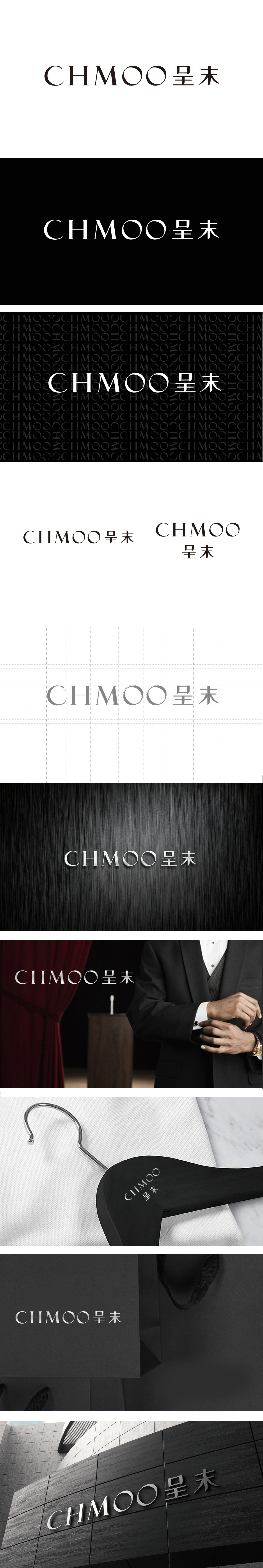
狮动设计以无衬线体为基底,线条粗细均匀且边缘锐利(如“C”“H”“M”的直线与弧线转折),传递出男装的精准剪裁感;两个连续的“O”采用正圆形设计,形成视觉焦点,既打破字母排列的单调,又隐喻“圆满合身”的理念。字母间距宽松且左右对齐,“H”“M”的竖线与“O”的曲线形成刚柔对比,符合高端男装的沉稳调性。整体设计没有夸张图形,而是通过字体本身的“型”与“意”传递“低调奢华”与“专属定制”的品牌气质。
Lion design conveys the precise tailoring sense of men's wear by taking sans serif as the base, with uniform lines and sharp edges (such as the straight line and arc turning of "C", "H" and "M"); Two consecutive "O" s are designed in a right circle to form a visual focus, which not only breaks the monotony of letter arrangement, but also symbolizes the concept of "perfect fit". The letters are loosely spaced and aligned left and right. The vertical lines of "H", "M" and the curve of "O" form a rigid-flexible contrast, which conforms to the calm and tonality of high-end men's wear. The overall design does not have exaggerated graphics, but conveys the brand temperament of "low-key luxury" and "exclusive customization" through the "type" and "meaning" of the font itself..


扫码或拨打添加客服微信


