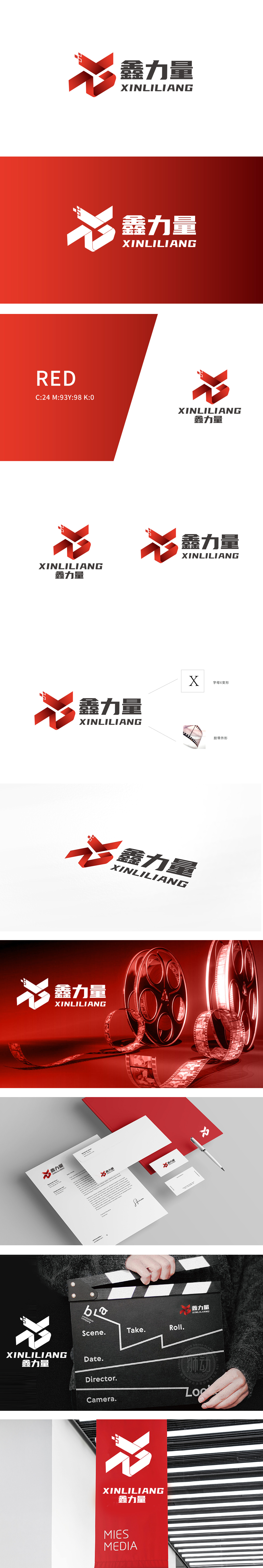
狮动设计以首字母“X”被解构为交错的红色立体丝带,突破常规字母的静态呈现——直线棱角象征“力量”的坚定感,卷曲弧度则暗合影视行业的“流动叙事”特性。红色作为视觉主色调,既传递热情与活力,又与影视内容传播中的“焦点感”高度契合,强化品牌记忆点。胶片元素是点睛之笔:传递“鑫力量”在影视制作、内容传播领域的业务属性。此LOGO通过“X=交错=连接/传播”“胶带=影视载体”的双重隐喻,符合娱乐文化领域“视觉优先”的传播规律。
Lion design is deconstructed into interlaced red three-dimensional ribbons with the initial letter "X", which breaks through the static presentation of conventional letters-straight edges and corners symbolize the firmness of "strength", while the curling radian coincides with the "flowing narrative" characteristics of the film and television industry. Red, as the main color of vision, not only conveys enthusiasm and vitality, but also is highly compatible with the "sense of focus" in the spread of film and television content, and strengthens the brand memory. The film element is the finishing touch: it conveys the business attributes of "Xin Power" in the fields of film and television production and content communication.


扫码或拨打添加客服微信


