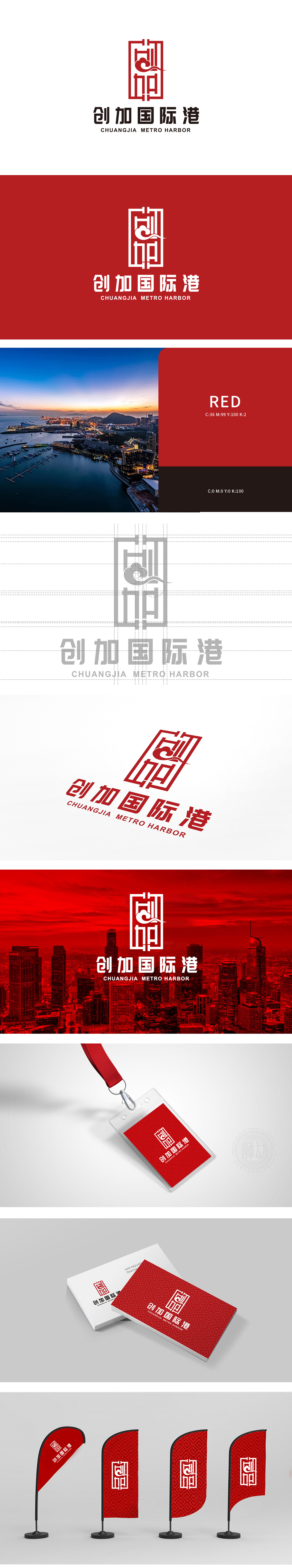
狮动设计以红色方形“印章”为基底,印章是中国传统文化中权威、诚信的象征,契合“国际港”的稳重属性。内部线条通过几何化的“回纹”变形,构建出类似“门”“窗”的空间层次,既呼应了“港”的空间属性(开放、连接),又暗合中式建筑的对称美学,传递出“通达四方”的意境。点睛之笔:祥云纹的灵动破局,祥云是中式文化中吉祥、高升的经典符号,既保留了传统祥瑞寓意,又赋予标志动态的现代气息,仿佛港口之上的云卷云舒,兼具文化深度与视觉张力。红色印章的“守正”与祥云曲线的“创新”、几何框架的“理性”与文化符号的“感性”,共同塑造出一个兼具“中国辨识度”和“国际审美力”的品牌形象。
Lion design is based on the red square "seal", which is a symbol of authority and honesty in China traditional culture, and fits the sedate attribute of "international port". The internal lines are deformed by geometric "palindromes", and a spatial hierarchy similar to "doors" and "windows" is constructed, which not only echoes the spatial attributes of "harbor" (openness and connection), but also coincides with the symmetrical aesthetics of Chinese architecture, and conveys the artistic conception of "reaching all directions". The finishing touch: Xiangyun pattern is a clever break. Xiangyun is a classic symbol of auspiciousness and elevation in Chinese culture.


扫码或拨打添加客服微信


