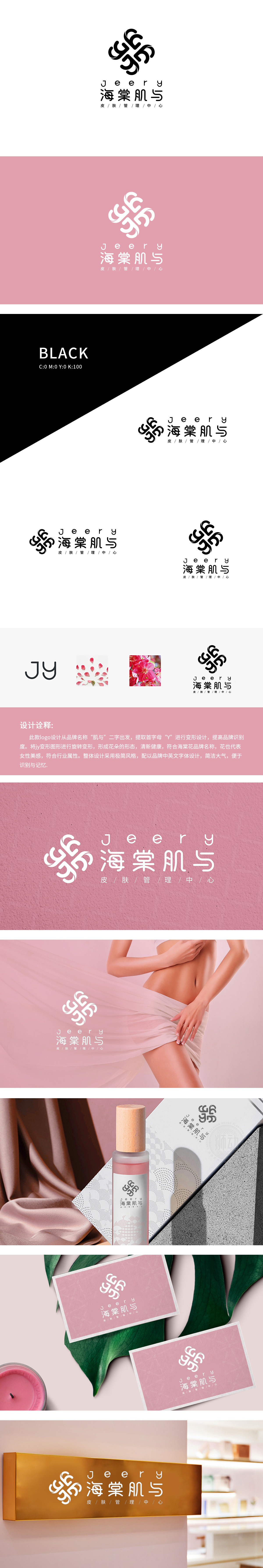
狮动设计以品牌名“肌与”的首字母“JY”为起点,通过旋转、对称变形将“Y”解构为花瓣形态,既保留了字母的识别基因,又通过重复韵律形成绽放的花朵轮廓,同时花瓣的轻盈感传递出皮肤管理行业追求的“清新健康”理念。柔和的低饱和粉,强化了品牌与“肌”(肌肤护理)的直接关联,传递温柔、专业的服务调性。这种“抽象符号→具象联想→品牌认知”的链路,有效提升了品牌传播效率。文字部分选用无衬线字体,笔画纤细利落,与花朵图形的柔美形成“刚柔并济”的视觉节奏传递“以自然之力唤醒健康肌底”的品牌主张。
Lion Design takes the initial letter JY of the brand name "Muscle and" as the starting point, and decomposes "Y" into petal shape through rotation and symmetrical deformation, which not only retains the recognition gene of letters, but also forms the outline of blooming flowers through repeated rhythm, and at the same time, the lightness of petals conveys the concept of "fresh and healthy" pursued by the skin management industry. Soft low saturated powder strengthens the direct connection between the brand and "muscle" (skin care), and conveys gentle and professional service tonality. This link of "abstract symbol → concrete association → brand recognition" has effectively improved the efficiency of brand communication. The text part uses sans serif fonts, and the strokes are slender and neat.


扫码或拨打添加客服微信


