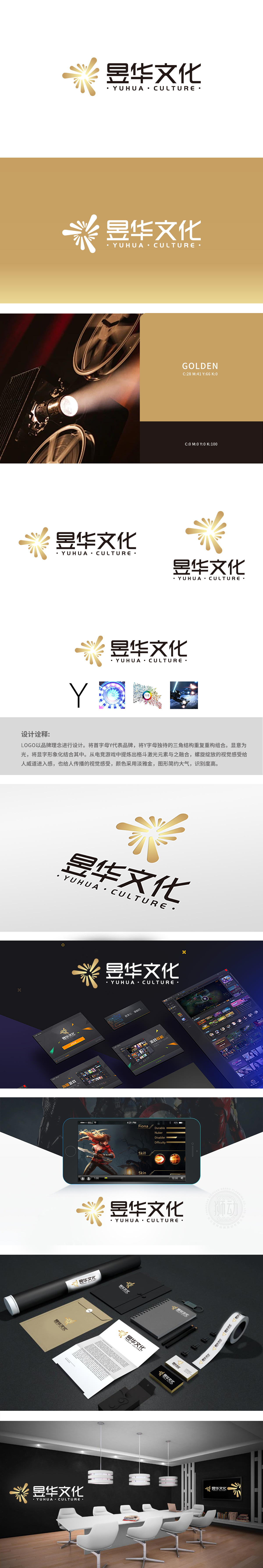
狮动设计以品牌首字母“Y”为起点,通过其“三角结构”的重复重构,创造出形似“光”的放射状图形——金色光芒从中心向外扩散,既呼应“昱”(日光、光明)的字义,又通过螺旋绽放的动态感,传递出“文化如光,向外辐射传播”的意象。这种将字母结构与汉字内涵(“昱”=日+立,象征光明升起)结合的设计,实现了“形”与“意”的双重统一。这种“传统字义+现代科技元素”的混搭,打破了文化品牌的刻板印象,赋予其前沿感与活力。设计通过“光芒绽放”的视觉语言,将抽象的“文化传播”具象为“能量扩散”的过程:激光、粒子、星际等元素,暗喻文化突破边界、跨领域传播的可能性,尤其贴合年轻文化等新兴场景,实现了“传统底蕴+潮流载体”的精准对接。
Lion Design starts with the brand initials "Y", and through the repeated reconstruction of its "triangle structure", it creates a radial figure shaped like "light"-golden light spreads outward from the center, which not only echoes the meaning of "Yu" (sunlight and light), but also conveys the image of "culture is like light, radiating and spreading outward" through the dynamic sense of spiral blooming. This design, which combines the letter structure with the connotation of Chinese characters ("Yu" = day+standing, symbolizing the rising of light), realizes the double unity of "shape" and "meaning". This mix of "traditional meaning and modern scientific and technological elements" breaks the stereotype of cultural brands and gives them a sense of cutting-edge and vitality. Through the visual language of "light blooming", the design takes the abstract "cultural communication" as the process of "energy diffusion".


扫码或拨打添加客服微信


