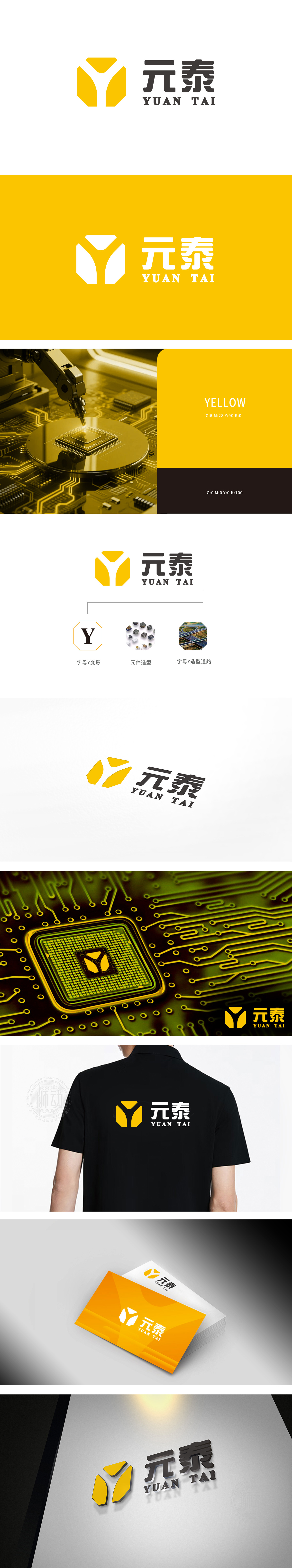
狮动设计采用白色字母“Y形线条” 其线条的“分支感”和“节点感”暗合电子领域的关键意象:Y形分叉可联想为电子电路中的“分支节点”,传递“精准控制”“信号传导”的技术属性。Y形道路的“延伸性”与电子元件的“连接性”结合,传递品牌不仅是“产品提供者”,更是“技术链路的构建者,整体设计通过 “Y形核心符号+元件/道路意象”的组合,既保留了电子领域的“精密感”“连接感”,又通过几何抽象和色彩对比实现了现代感与记忆点。体现了符号即业务,视觉即信任。
The white "Y-shaped line" used in Lion Motion design is not only the deformation of the letter "Y", but also the sense of branching and node of the line coincides with the key image in the electronic field: Y-shaped bifurcation can be associated with the "branch node" in electronic circuits, which conveys the technical attributes of "precise control" and "signal conduction". The extension of Y-shaped road is combined with the connectivity of electronic components, and the brand is not only a product provider, but also a builder of technical links. Through the combination of Y-shaped core symbol+component/road image, the overall design not only retains the sense of precision and connectivity in the electronic field.


扫码或拨打添加客服微信


