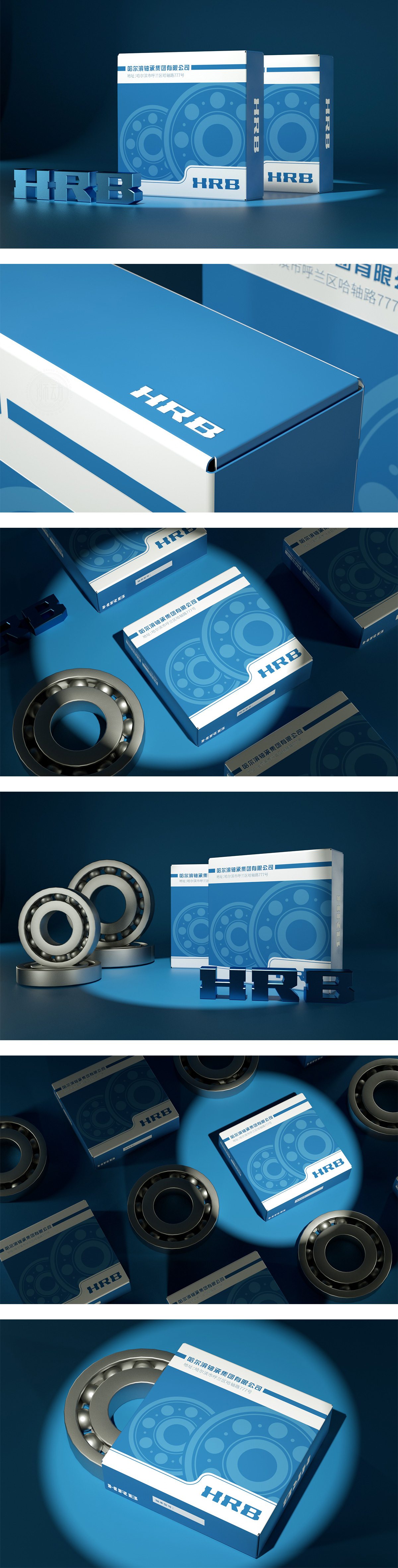
狮动设计以深蓝渐变主色调构建“工业科技”级冷峻氛围,核心图形以“轴承三重奏”突破传统包装审美框架——既有实体轴承的立体肌理,又有几何圆环的无限延展,更有负空间中暗藏的“运动轨迹”隐喻。深蓝渐变如精密仪器操作面板,金色点缀似金属切削火花,两色碰撞瞬间激活工业品认知,主图轴承的“内外圈+滚动体”结构,既展示产品核心构造,又以“环环相扣”的视觉逻辑传递“全流程品控”信任感;打造“看一眼就记住”的战略包装。
Lion design builds a cold atmosphere of "industrial science and technology" with the gradient main color of deep blue, and the core graphics break through the traditional packaging aesthetic framework with the "bearing trio", which has not only the three-dimensional texture of the solid bearing, but also the infinite extension of the geometric ring, and even the metaphor of "movement track" hidden in the negative space. The dark blue gradient is like the operation panel of precision instruments, and the gold embellishment is like metal cutting sparks.


扫码或拨打添加客服微信


