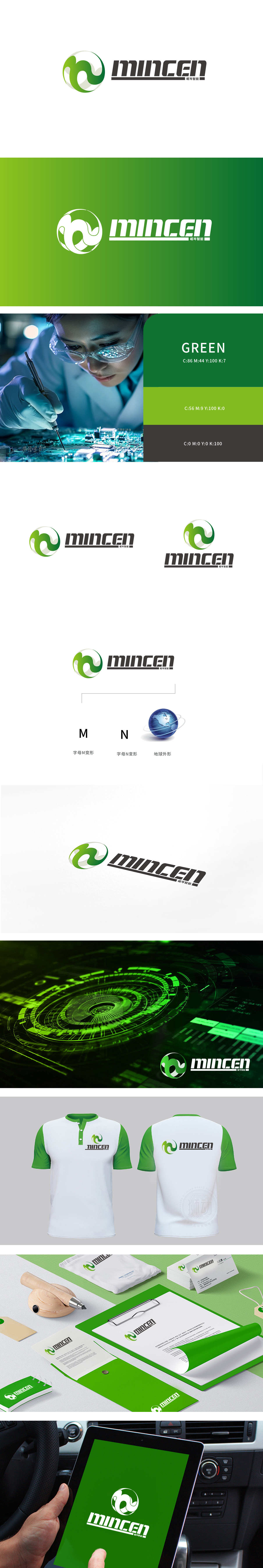
狮动设计以“M”为骨架,通过流畅的曲线与对称结构,既保留了重工机械常见的力量感轮廓,又通过渐变绿色弱化了传统重工的硬朗,注入科技企业的环保与智能化属性,“N”字母的隐藏衔接:强化品牌名称与图形的整体性,暗合重工机械中“模块化拼接”的逻辑,传递企业在技术整合、系统集成上的能力。地球元素的行业定位可视化,既象征业务覆盖范围,又暗示“智能全球化”的科技内核。标志整体采用“图形-文字-地球”的三模块布局,从左至右形成“品牌符号→名称识别→行业愿景”的递进式信息链,符合“传统重工向智能化、全球化转型”的品牌定位。
Lion esign takes "M" as the skeleton, and through smooth curve and symmetrical structure, it not only retains the common sense of strength outline of heavy machinery, but also weakens the toughness of traditional heavy industry through gradual green change, injecting the environmental protection and intelligent attributes of science and technology enterprises, and the hidden connection of "N" letters: strengthening the integrity of brand name and graphics, coinciding with the logic of "modular splicing" in heavy machinery, and conveying the ability of enterprises in technology integration and system integration. Visualization of industry positioning of earth elementsIt not only symbolizes the business coverage.


扫码或拨打添加客服微信


