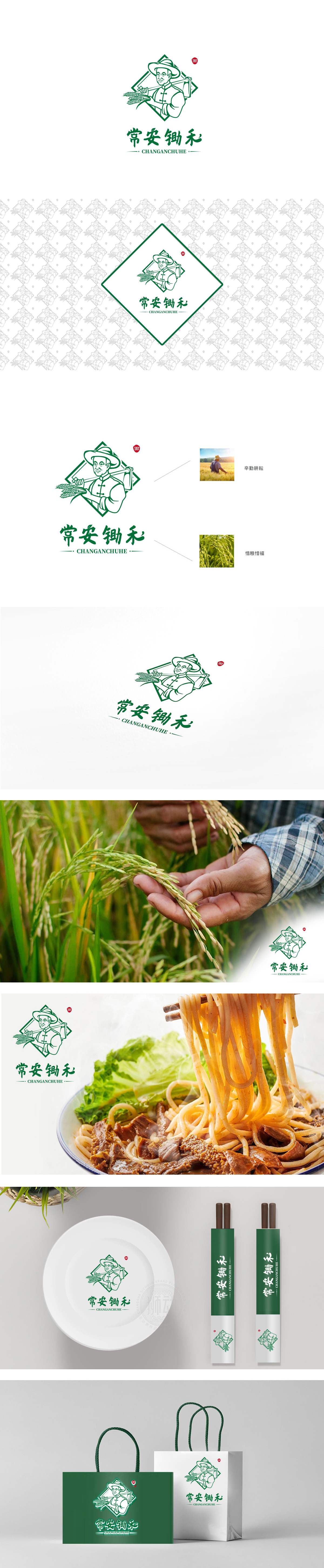
狮动设计以“农耕意象”锚定品牌基因,手持锄头、怀抱稻穗的农夫形象,直观展现“锄禾”的农耕场景,与品牌名称“常安锄禾”直接呼应,。农夫的草帽、中式对襟衣体现传统农耕文化;稻穗颗粒饱满,强化“粮食”的核心品类联想,主色调为绿色(象征自然、健康、田野),整体配色清新且接地气,符合消费者对“农家菜”“放心食材”的心理预期,“常安”传递“安稳、家常”的亲切感,“锄禾”直接关联古诗“锄禾日当午”的文化记忆,唤醒大众对农耕辛劳的集体认知,强化“接地气、不浮夸”的品牌调性。传递“像家里做饭一样实在、健康”的心理暗示。
Lion Design anchors the brand gene with "farming image", and displays the farming scene of "weeding" intuitively with the image of a farmer holding a hoe and holding an ear of rice, which directly echoes the brand name "Chang 'an weeding". Farmers' straw hats and Chinese double-breasted clothes embody traditional farming culture; The ears of rice are full of grains, which strengthen the association of the core category of "grain". The main color is green (symbolizing nature, health and field), and the overall color matching is fresh and grounded, which conforms to consumers' psychological expectations of "farm food" and "safe ingredients".


扫码或拨打添加客服微信


