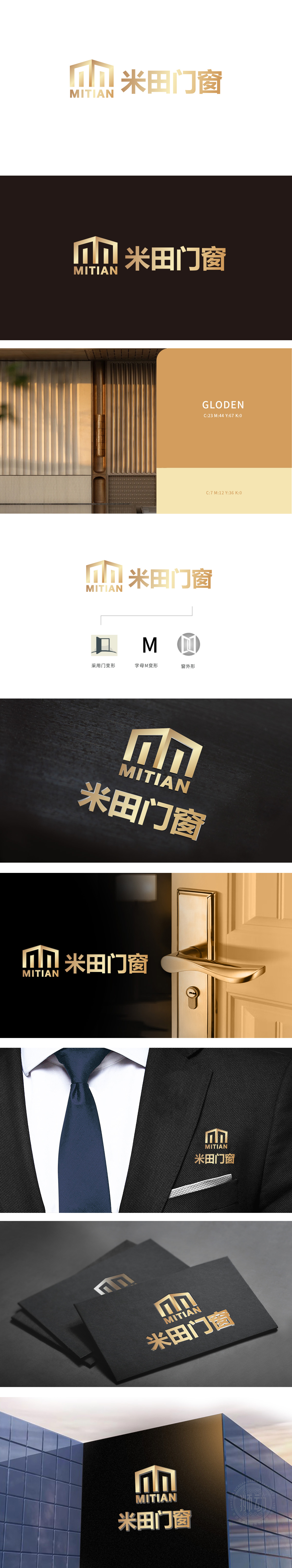
狮动设计采用“M”首字母变形,又通过立体几何切割,将“门”的意象融入字体设计,线条硬朗且富有金属质感,既象征门窗产品的坚固材质,又暗合“米田”的中文发音,实现了“形”与“意”的统一。以抽象的折叠门板造型为核心,直观传递“门”的功能属性;“窗外形”则用圆形轮廓包裹对开式窗扇,既呼应门窗的实用形态,又通过对称结构强化稳定感,精准锚定“门窗建材”的行业定位。整体采用香槟金/金色系,既传递出高端、品质感,为建材品牌注入一丝温暖与精致,适合家居场景的情感联想。
Lion design uses the deformation of the initial letter "M", and through solid geometric cutting, the image of "door" is integrated into the font design. The lines are tough and rich in metallic texture, which not only symbolizes the solid material of doors and windows, but also coincides with the Chinese pronunciation of "Mitian", realizing the unity of "shape" and "meaning". Taking the abstract folding door panel modeling as the core, the functional attributes of the "door" are conveyed intuitively; The "window shape" wraps the sash with a circular outline.


扫码或拨打添加客服微信


