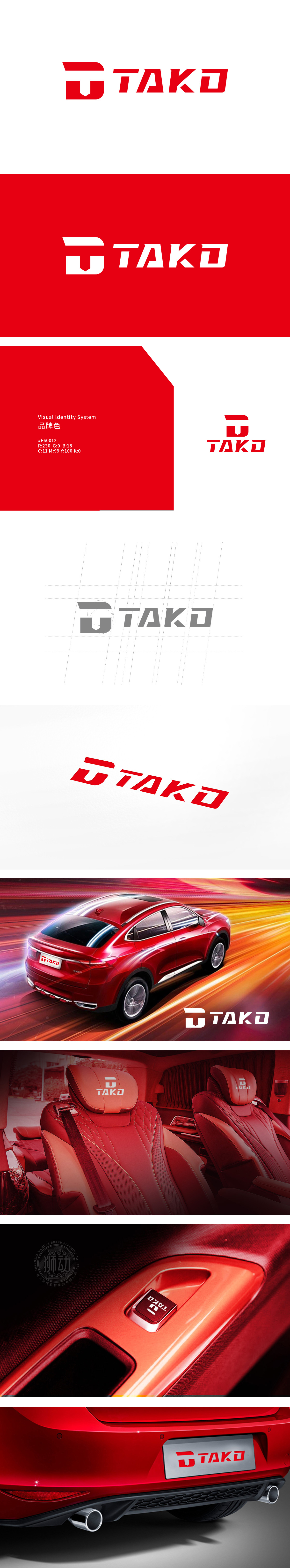
狮动设计以字母“TAKO”为基底,采用几何化无衬线字体,线条硬朗、棱角分明,呈现出“工业级的精准感,传递出机械感与现代工业美学,强调力量感与科技属性。TAKO”标志通过色彩、线条、结构传递出“运动、科技、力量”的核心气质,整体以“硬朗的几何美学”为骨架,“激情的色彩碰撞”为点缀,“功能与形式的高度统一”为目标,打造兼具视觉冲击力与实用价值的驾驶空间。
Lion design uses geometric sans-serif fonts with the letter "TAKO", with tough lines and sharp edges, showing a sense of "industrial precision", conveying a sense of machinery and modern industrial aesthetics, and emphasizing a sense of strength and scientific and technological attributes. TAKO "logo conveys the core temperament of" sports, technology and strength "through color, line and structure. As a whole, it takes" tough geometric aesthetics "as the skeleton," passionate color collision "as the ornament, and" high unity of function and form "as the goal to create a driving space with both visual impact and practical value.


扫码或拨打添加客服微信


