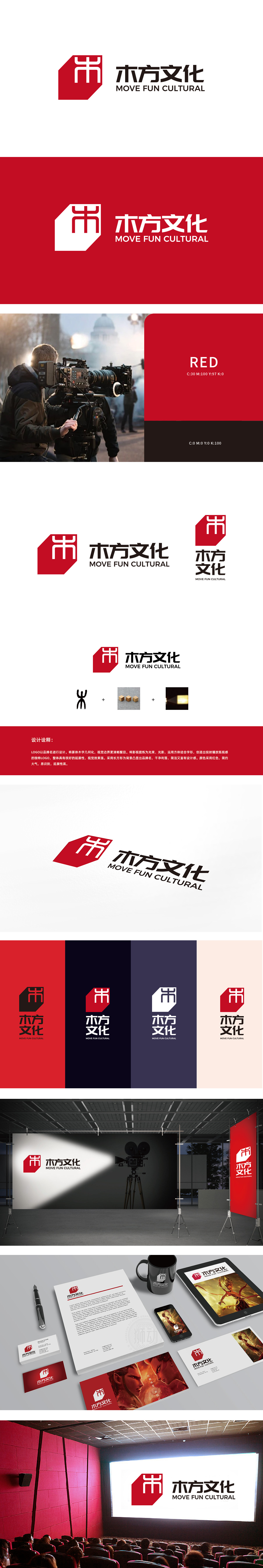
狮动设计以“木方”二字为核心,将篆体“木”字进行几何化重构——红色方形背景中,白色“木”字通过直线切割与转折,既保留了汉字“木”的形态辨识度,又赋予其建筑般的结构美感,暗合“方”的方正属性。立方体:呼应“木方”名称,立方体的堆叠感象征“内容的模块化创作”与“多维度呈现”,红色温暖质感传递“贴近生活、可触摸的文化体验”;光束投影:聚焦“光影”这一娱乐核心载体,明暗对比的视觉效果既象征“创意点亮文化”,也隐喻“通过技术让传统文化‘活’起来”的品牌使命。 通过“+”连接,形成“文化根源+内容构建+技术赋能”的逻辑闭环,展现文化娱乐品牌从“挖掘”到“创造”再到“传播”的全链条价值。
Lion design takes the word "wood square" as the core, and geometrically reconstructs the word "wood" in seal script. In the red square background, the white word "wood" is cut and turned in a straight line, which not only retains the morphological recognition of Chinese character "wood", but also gives it an architectural structural aesthetic feeling, which coincides with the founder attribute of "square". Cube: echoing the name of "Mufang", the stacking sense of cube symbolizes "modular creation of content" and "multi-dimensional presentation", and the warm red texture conveys "cultural experience close to life and touchable"; Beam projection: Focus on "light and shadow".


扫码或拨打添加客服微信


