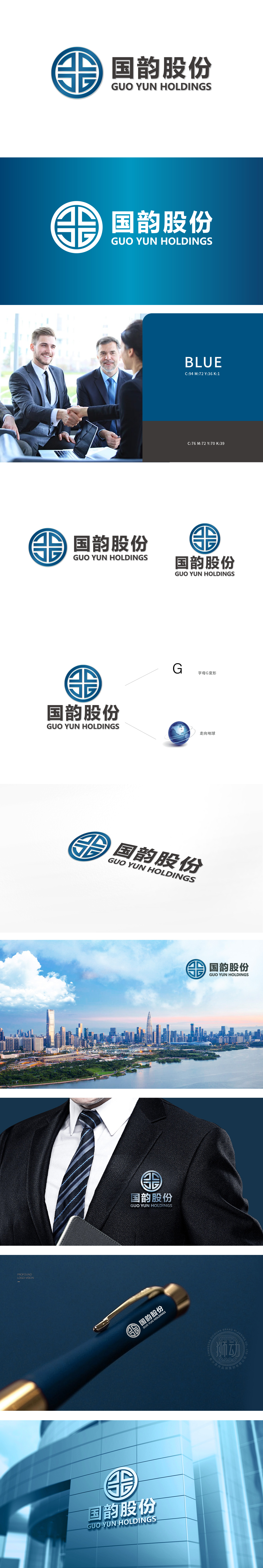
狮动设计采用“国”“韵”二字为核心点,由十字交叉的线条与方形块面构成,传递出稳重、权威的企业气质。双环圆形设计,象征圆满、包容,传递企业的整体性与稳定性;蓝色关联“专业、信任、科技”,实现“现代行业色+传统文化色”的融合。整体设计既保留了中式美学的庄重与底蕴,又通过几何化图形,勾勒出综合型集团的“双面气质,成为“有底蕴、有实力”的综合型集团。
The vision of the word "country" and "rhyme" used in the lion dance design is composed of crossed lines and square blocks, which conveys a stable and authoritative enterprise temperament. Double-ring circular design symbolizes perfection and tolerance, and conveys the integrity and stability of the enterprise; Blue is associated with "professionalism, trust and technology" to realize the integration of "modern industry color+traditional culture color".


扫码或拨打添加客服微信


