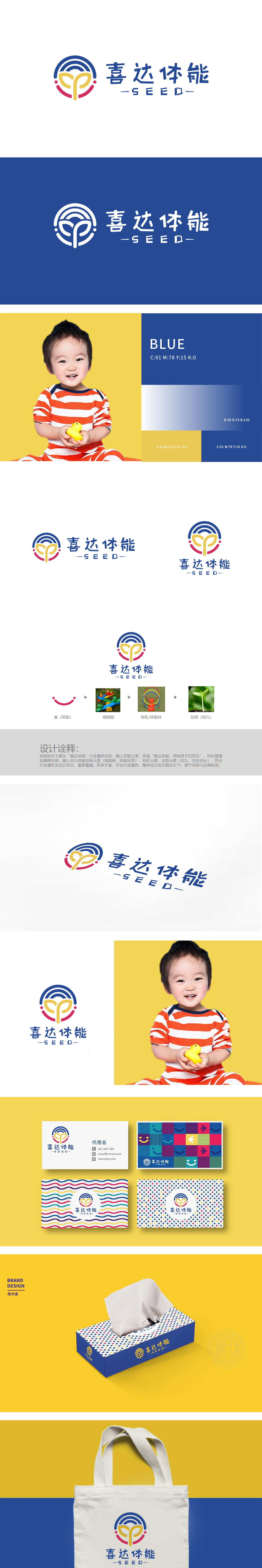
狮动设计采用蓝白渐变圆环,不仅代表“彩虹”的多彩与活力,其环形结构也暗合“体能环”的训练道具意象;红粉色线条勾勒出抽象笑脸轮廓,弧度柔和且富有亲和力,直接呼应“喜”字传递的快乐属性;中间的黄色“Y”形结构既是幼苗的抽象形态(象征幼儿“茁壮成长”),又暗含“体能训练”的向上姿态,将“幼儿”与“成长”的核心受众特征视觉化。用一场「符号的狂欢」,直接击穿了幼儿体能教育的视觉表达边界!
The blue-and-white gradual change ring is adopted in the lion dance design, which not only represents the color and vitality of "rainbow", but also coincides with the training prop image of "physical ring". The red and pink lines outline the abstract smiling face, with soft radian and rich affinity, which directly echoes the happy attribute conveyed by the word "Xi"; The yellow "Y"-shaped structure in the middle is not only the abstract form of seedlings (symbolizing children's "vigorous growth"), but also implies the upward posture of "physical training", visualizing the core audience characteristics of "children" and "growth". With a "carnival of symbols", it directly penetrated the visual expression boundary of children's physical education!


扫码或拨打添加客服微信


