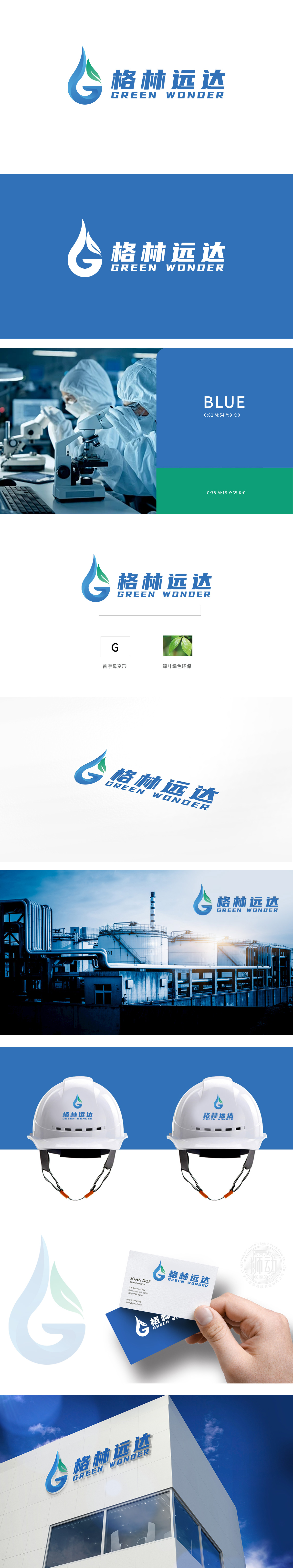
狮动设计以蓝色水滴为主体轮廓,嵌入绿叶,既直观体现“水”与“植物”这两大环保核心元素,又通过流畅的曲线形成字母“G”的变形,实现“品牌标识”与“自然符号”的双重表达。水滴是生命之源的具象,叶片是绿色希望的图腾,而流动的曲线则暗喻环保事业的永续动力。这种将“水资源保护”“生态平衡”“品牌基因”三重内核浓缩于一图的功力,让“环保”不再是抽象概念,而是能被看见、被感知、被铭记的视觉冲击力。
Lion design takes blue water droplets as the main outline and embeds green leaves, which not only intuitively reflects the two core elements of environmental protection, but also forms the deformation of the letter G through smooth curves, realizing the dual expression of "brand logo" and "natural symbol". Water drops are the embodiment of the source of life, leaves are the totem of green hope, and the flowing curve is a metaphor for the sustainable power of environmental protection.


扫码或拨打添加客服微信


