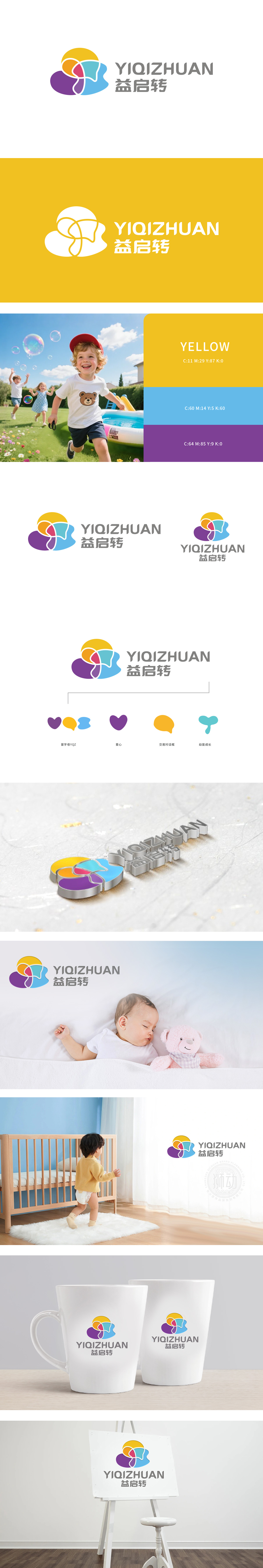
狮动设计采用爱心:直接关联“母爱”“关怀”,对话气泡(黄色/蓝色):代表“沟通”“互动”,暗示平台提供育儿交流、产品咨询等社区功能,贴合妈妈群体分享、求助的高频需求;幼苗(蓝绿色):以抽象的“萌芽”形态象征“宝宝成长”,呼应产品“助力成长”的核心诉求,同时传递品牌对“新生”的美好祝愿。整体设计由黄、橙、红、蓝、紫等柔和色块叠加而成,整体呈现云朵般的圆润轮廓,传递出产品所需的安全、柔软、温和特质。色块间相互交织,既像父母与孩子的拥抱,又象征平台连接“妈妈群体”“宝宝需求”“产品服务”的纽带作用,呼应电商“连接供需”的核心功能。
The lion movement design adopts love: it is directly related to "maternal love" and "care", and the dialogue bubble (yellow/blue) stands for "communication" and "interaction", suggesting that the platform provides community functions such as parenting communication and product consultation, which meets the high-frequency needs of mothers for sharing and seeking help; Seedling (blue-green): It symbolizes "baby's growth" in an abstract "budding" form, echoes the core demand of "helping growth" of products, and at the same time conveys the brand's good wishes for "rebirth". The overall design is made up of soft color blocks such as yellow, orange, red, blue and purple.


扫码或拨打添加客服微信


