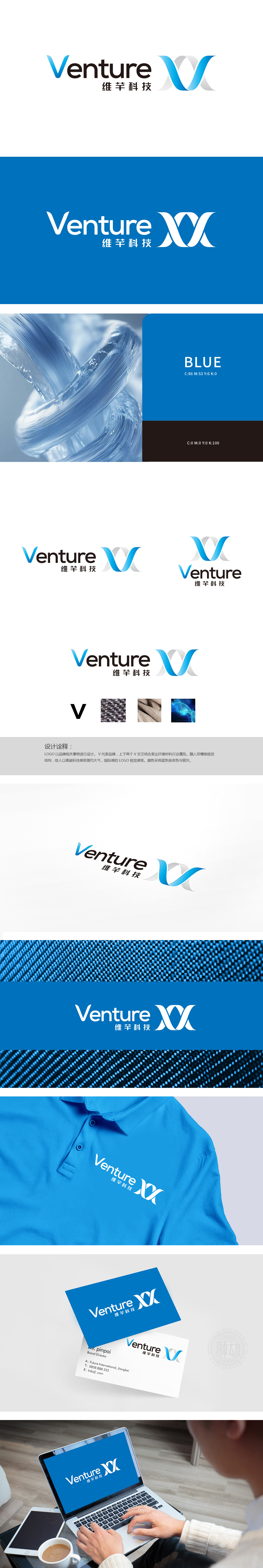
狮动设计以品牌核心“V”为基础,通过上下交叉的双V结构,既形成了纤维交织的动态视觉,又暗合“材料交织、科技融合”的行业特性。蓝色渐变+银灰色的配色方案,通过渐变层次避免单调,银灰色的加入则强化了材料的“质感与精密感”,与纤维材料的“高端化、精细化”定位高度契合。整体设计将“宏观纤维材料”与“微观科技研发”串联,诠释了品牌“从材料创新到科技突破”的定位,让抽象的LOGO有了可感知的行业场景支撑,既体现了纤维材料的“行业属性”,又赋予其“高科技、国际化”的品牌调性。
Lion design is based on the brand core "V", and through the double V structure that crosses up and down, it not only forms the dynamic vision of fiber interweaving, but also coincides with the industry characteristics of "material interweaving and technology integration".The color scheme of blue gradient+silver gray avoids monotony through gradient levels, and the addition of silver gray strengthens the "sense of texture and precision" of the material, which is highly consistent with the "high-end and refined" positioning of fiber materials.


扫码或拨打添加客服微信


