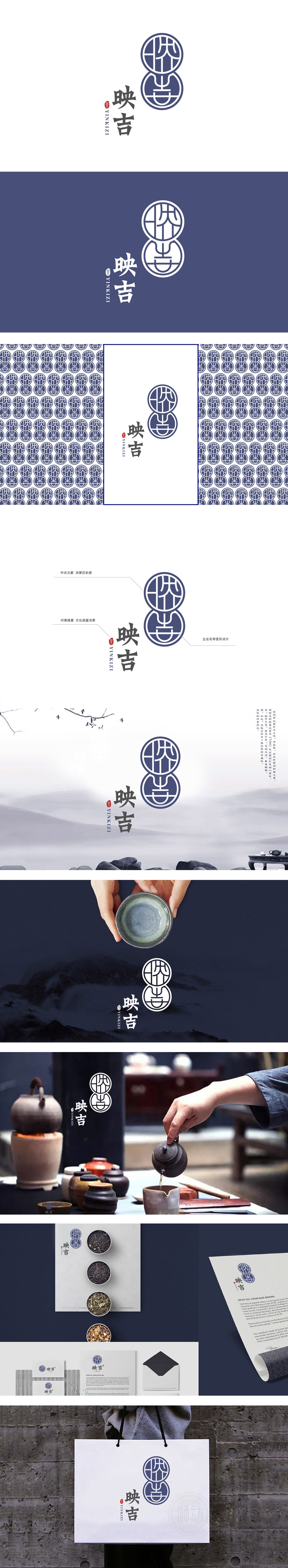
狮动设计以双圆结构 外层圆环采用传统“玉璧”造型,象征圆满、和谐,暗合茶道“和静怡真”的核心精神;上下圆形态似传统茶饼堆叠,既呼应茶叶的物理形态,又隐喻“层层甄选、品质叠加”的品牌理念。以抽象线条构成类似“茶”字的篆体变形,既体现中式美学“刚柔并济”的平衡感,又暗合茶器中“圆杯方底”的经典造型,强化行业属性;品牌名“映吉”中,“映”有“映照、呼应”之意,上下双圆通过中轴线对称,线条相互咬合,恰似“茶”与“吉”的映照融合,实现“形”与“意”的双重统一;
Lion design adopts the traditional "jade jade" shape with the outer ring of double-circle structure, which symbolizes perfection and harmony and coincides with the core spirit of "quietness, elegance and truth" in tea ceremony; The upper and lower circles are similar to the traditional stack of tea cakes, which not only echoes the physical form of tea, but also symbolizes the brand concept of "layer selection and quality superposition".The deformation of seal characters similar to the word "tea" is formed by abstract lines, which not only reflects the sense of balance between rigidity and softness in Chinese aesthetics, but also coincides with the classic shape of "round cup and square bottom" in tea ware, and strengthens the industry attribute;


扫码或拨打添加客服微信


