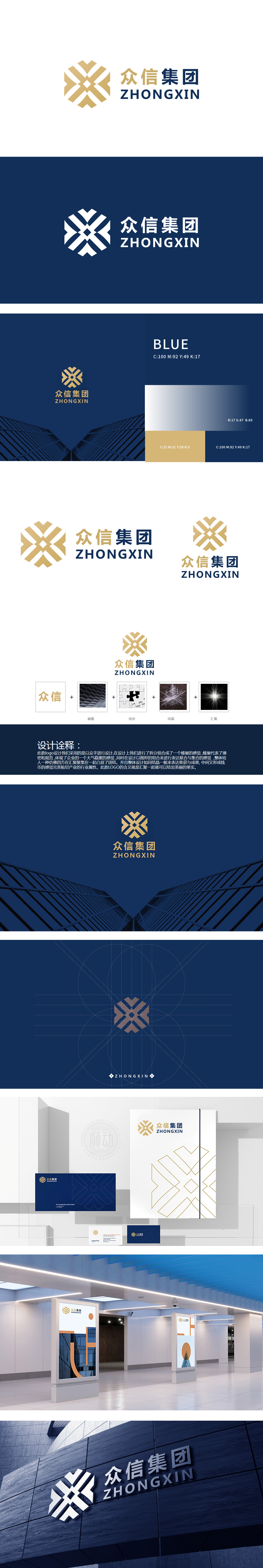
狮动设计以“众”字为原型进行解构重组,通过几何线条的交错编织,形成多层视觉隐喻:蜂巢结构的秩序感,传递出规模化、系统化的集团属性。结晶与汇聚的动态感:既像“雪花结晶”般象征成果的凝聚与价值沉淀,又通过“汇集”的视觉张力,强化“四方聚势”的品牌主张。货币符号的行业暗示,巧妙植入金融/产业投资类企业的行业属性,使抽象图形与商业本质产生关联。整体将“众”字的笔画转化为可组合的“单元”,通过线条的交叉、叠加、汇聚,完成了一次“从汉字到商业图腾”的华丽蜕变。
Lion Design deconstructs and reorganizes with the word "Zhong" as the prototype, and through the interweaving of geometric lines, it forms a multi-layer visual metaphor: the sense of order of honeycomb structure, which conveys the large-scale and systematic group attribute. The dynamic sense of crystallization and convergence: it not only symbolizes the cohesion and value precipitation of achievements like "snowflake crystallization", but also strengthens the brand proposition of "four directions gathering potential" through the visual tension of "convergence".


扫码或拨打添加客服微信


