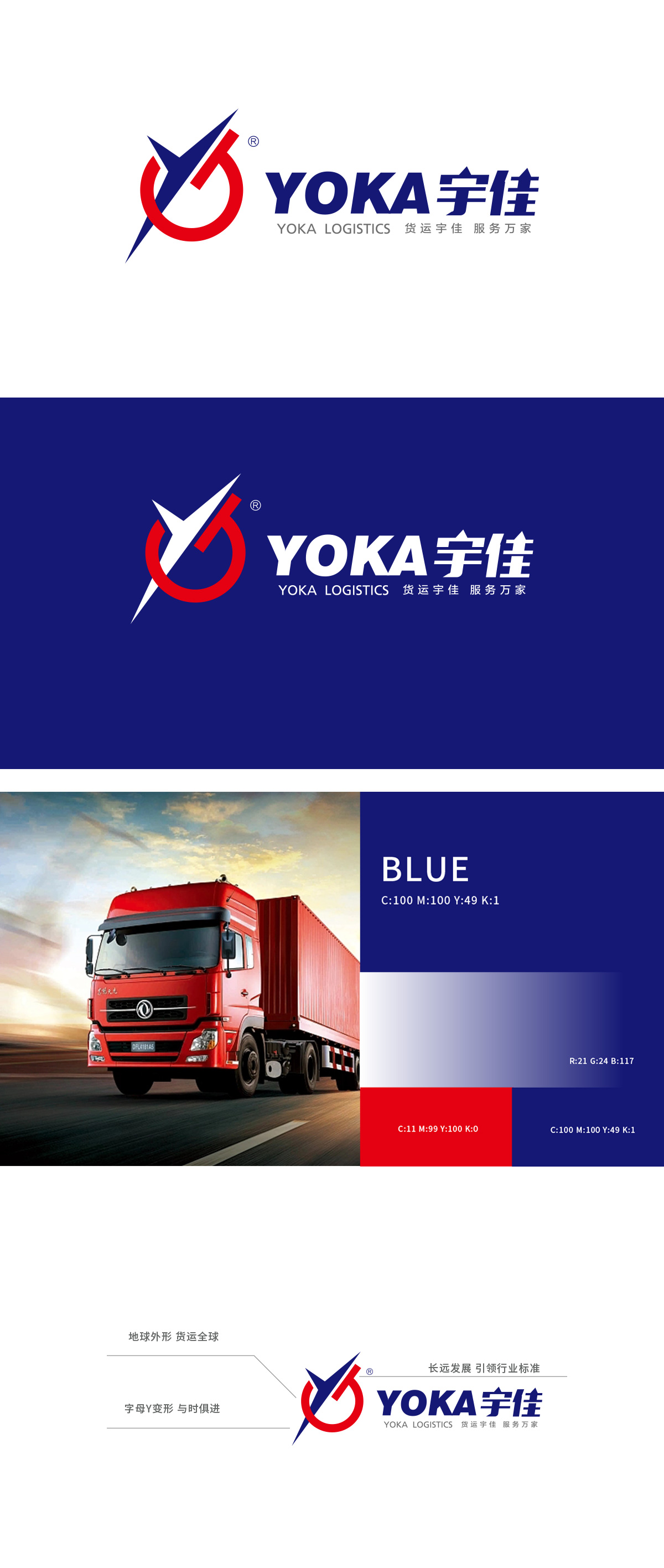
狮动设计以品牌首字母“Y”为创意原点,通过尖锐的蓝色折线与红色圆弧构成主体形态:蓝色折线,既像抽象的“箭头”象征物流运输的速度与方向感,硬朗线条传递专业、高效的行业特质。地球外形”的隐喻通过红色圆环实现,结合“Y”形箭头的动态感,直接传递“货运全球”的业务范围;折线与圆环的组合可延伸为“运输网络”的抽象符号——折线代表干线运输的高效直达,圆环代表全球节点的覆盖,形成“点-线-面”的物流生态视觉化呈现。既通过字母变形强化品牌识别,又用色彩与图形隐喻传递物流行业的速度、范围、专业性,同时将“全球化”“创新”“服务”等抽象理念转化为可感知的视觉符号。
Lion Design takes the brand initials "Y" as the creative origin, and forms the main form through sharp blue polylines and red arcs: the blue polyline not only symbolizes the sense of speed and direction of logistics and transportation like an abstract "arrow", but also conveys professional and efficient industry characteristics through tough lines. The metaphor of "the shape of the earth" is realized through the red circle, and combined with the dynamic sense of the "Y" arrow, it directly conveys the business scope of "global freight"; The combination of broken line and circular ring can be extended to the abstract symbol of "transportation network"-broken line represents the efficient direct transportation of trunk lines, and circular ring represents the coverage of global nodes.


扫码或拨打添加客服微信


