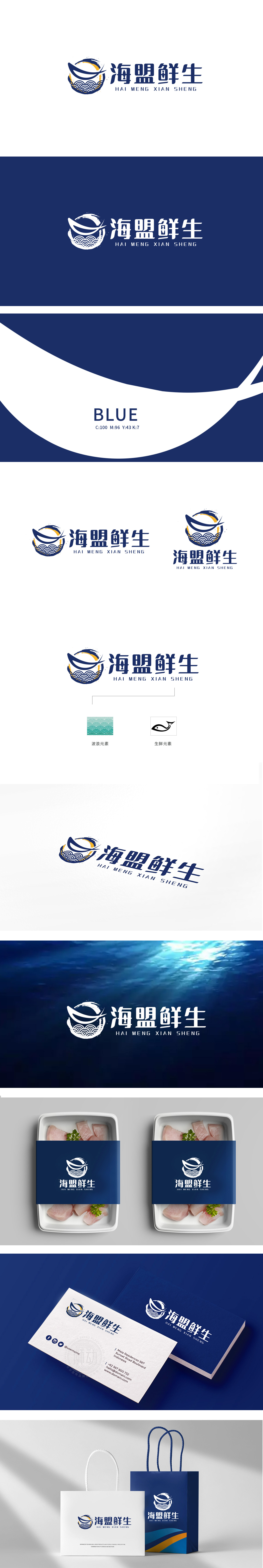
狮动设计以“圆形”为基底,内部嵌套三层核心元素,上层:蓝色鱼形曲线,线条流畅灵动,既像跃出水面的鱼,又暗合“鲜生”的鲜活感;中层:橙黄色渐变的弧形色块,模拟阳光洒在海面的光影,传递温暖、新鲜的氛围;下层:传统水波纹图案(蓝白相间),“浪花纹”强化海洋属性,形成视觉呼应。主色调采用深海蓝(信任、专业)与暖橙黄(新鲜、活力)对比,搭配白色背景,既符合生鲜行业的洁净感,又通过冷暖色碰撞增强视觉张力。“从海洋到餐桌”的生鲜链路可视化,狮动用一个图形讲完“产地直供、鲜活直达”的品牌故事。
Lion design is based on "circle", with three layers of core elements nested inside. The upper layer: blue fish-shaped curve with smooth lines, which is like a fish jumping out of the water and coincides with the freshness of "freshness";Middle layer: orange-yellow gradient arc-shaped color block, which simulates the light and shadow of sunlight on the sea surface and conveys a warm and fresh atmosphere; Lower layer: traditional water ripple pattern (blue and white), "wave pattern" strengthens the marine attribute and forms a visual echo. The main color is dark blue (trustful and professional) compared with warm orange yellow , with a white background, which not only conforms to the cleanliness of the fresh food industry.


扫码或拨打添加客服微信


