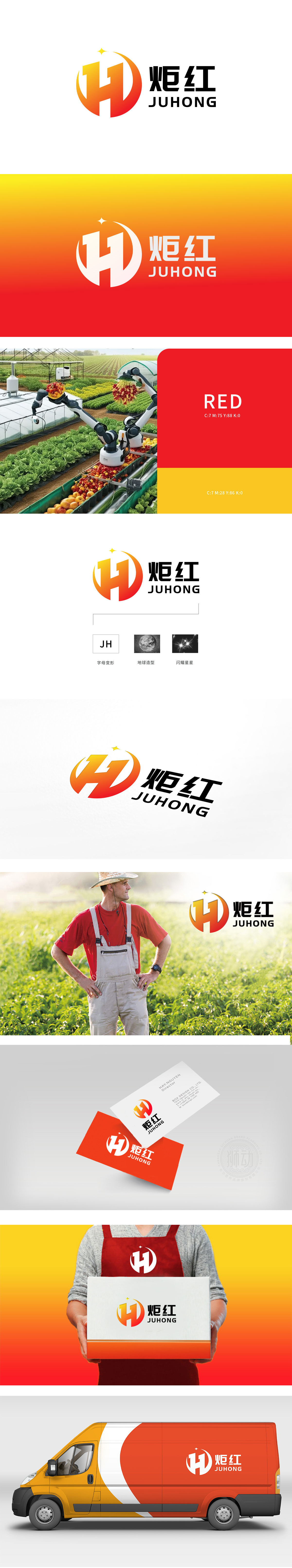
狮动设计以渐变“H”与J环形的双重象征,“传递“耕耘-收获”的核心逻辑。星星的“闪耀”象征科技赋能农业,渐变橙红配色:橙色象征土地的温暖、果实的成熟,红色代表丰收的热烈、作物的旺盛生命力,二者结合传递农业生产中“阳光充足、果实饱满”的积极联想。整体设计传递“以科技点亮农业,以生态孕育丰收”的品牌理念,既保留了农业的本源温度,又展现了行业的未来潜力。
Lion design "conveys the core logic of" cultivation-harvest "with the double symbols of gradual change" H "and" J ring ". The "shining" of the stars symbolizes the empowerment of agriculture by science and technology, and the gradual orange-red color scheme: orange symbolizes the warmth of the land and the maturity of fruits, and red represents the enthusiasm of harvest and the vigorous vitality of crops. The combination of the two conveys the positive association of "full sunshine and full fruits" in agricultural production.


扫码或拨打添加客服微信


