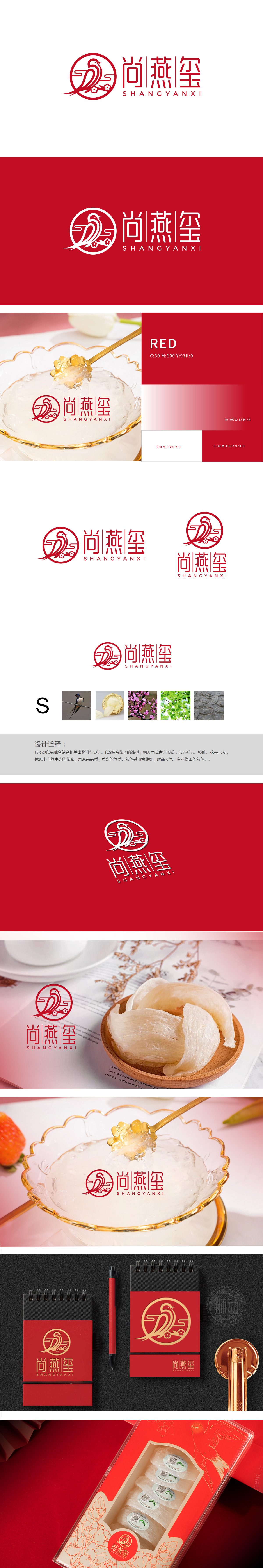
狮动设计以“燕子”为核心视觉符号,同时将品牌名首字母“S”的曲线形态与燕子的动态轮廓自然结合:燕子展翅的流线型身体既呼应了“S”的柔美感,又通过尾部的尖细线条增强了灵动性,直观传递出“燕窝源自自然生灵”的产品属性燕子(生物来源)、燕窝(产品本体)、梅花/绿叶(自然生态)、祥云纹(传统文化) 四个元素形成明确的视觉叙事链:前两者直接点明产品核心(燕窝),后两者通过“梅兰竹菊”中的梅花(象征高洁、滋补)、绿叶(天然健康)、祥云纹(吉祥、尊贵),将“保健品”的功能价值(滋补)延伸至文化价值(品位、传统养生理念),符合高端滋补品的品牌调性。整体设计巧妙融合了品牌核心属性与传统文化意象,展现出对保健品中式美学与现代设计的平衡。
Lion design takes "Swallow" as the core visual symbol, and at the same time, it naturally combines the curved shape of the brand initials "S" with the dynamic outline of the swallow: the streamlined body of the swallow's wings not only echoes the feminine feeling of "S", but also enhances the agility through the tapering lines at the tail. Intuitively convey the product attributes of "Bird's Nest originated from natural creatures". The four elements, Swallow (biological source), Bird's Nest (product ontology), Plum Blossom/Green Leaf (natural ecology) and Xiangyun Pattern (traditional culture) form a clear visual narrative chain: the former two directly point out the product core (Bird's Nest), while the latter two directly point out the plum blossom (symbolizing nobleness and nourishing) and green leaf in "Mei Lan Zhu Ju".


扫码或拨打添加客服微信


