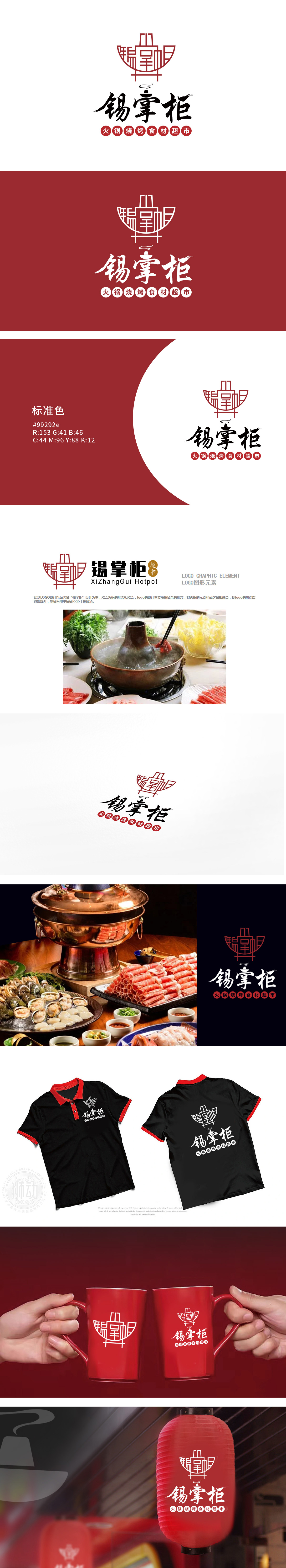
狮动设计以线条为骨,精准传递火锅品类与品牌个性,将“锡”的金属质感与“掌柜”的传统经营意象,通过线条化的火锅形态具象呈现:「掌柜」则暗合「前店后坊」的中式经营美学。,整体图形在极简线条中完成了“品牌名+品类(火锅)+传统餐饮文化”的三重信息传递,辨识度极高。采用单红色调,既符合火锅“热辣、温暖”的餐饮属性,LOGO以「锡」为媒、以「火」为魂,为「锡掌柜」勾勒出一幅兼具东方韵味与商业穿透力的餐饮视觉画卷。
Lion design takes lines as the bone, accurately conveys the hot pot category and brand personality, and presents the metallic texture of "tin" and the traditional management image of "shopkeeper" through the linear hot pot form: "shopkeeper" coincides with the Chinese management aesthetics of "front shop and back shop". The overall graphic completes the triple information transmission of "brand name+category (hot pot)+traditional catering culture" in minimalist lines, with high recognition. The color of Dan Hong is adopted.


扫码或拨打添加客服微信


