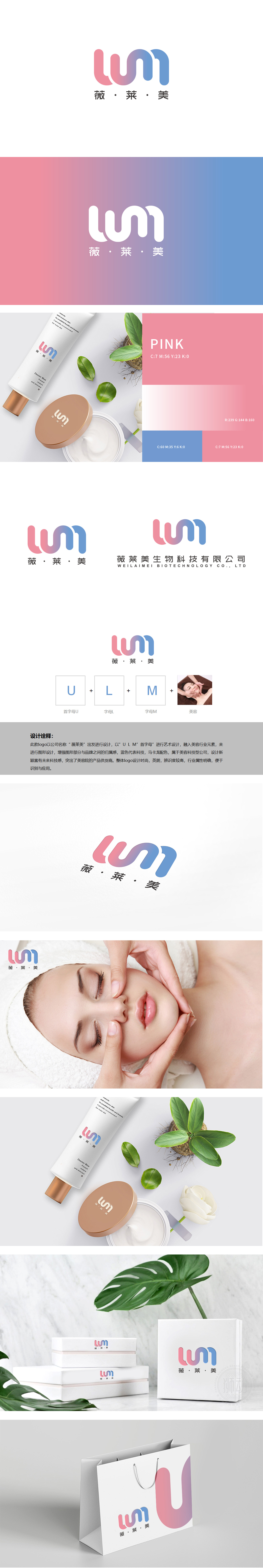
狮动设计以品牌名称“薇·莱·美”的字母“W、L、M”为核心,通过流畅的曲线线条将“U、L、M”三个字母进行艺术化连接,采用圆润、柔和的笔触,既符合美容行业“温柔、呵护”的属性,又通过渐变色彩传递出时尚感与科技感。主色调采用蓝紫色渐变(蓝色象征科技、专业,紫色/粉色系贴近美容行业的柔美、时尚),符合“美容科技型公司”的定位,强化“专业、时尚、未来感”的品牌气质。
Lion design takes the letters "W, L and M" of the brand name "Wei Lai Mei" as the core, artistically connects the letters "U, L and M" through smooth curves and lines, and adopts rounded and soft brushstrokes, which not only conforms to the "gentleness and care" attribute of the beauty industry, but also conveys a sense of fashion and technology through gradient colors. The main color adopts blue-purple gradient .


扫码或拨打添加客服微信


