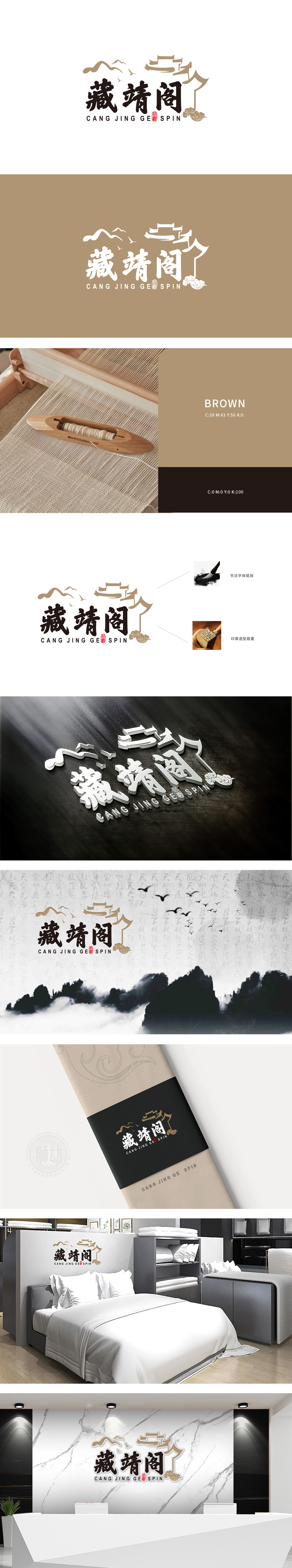
“藏靖阁”三字采用毛笔书法字体,笔画舒展流畅,兼具力度与柔美——这种笔触的灵动性,暗合纺织面料的柔软飘逸特质。字体边缘的自然晕染效果,仿佛水墨在织物上缓缓渗透,既保留了书法的“挺拔”风骨,又通过视觉联想传递出产品的亲肤、细腻质感,让“纺织”这一核心属性在传统文化符号中自然流露。背景中的远山、飞鸟、亭台等意象,以浅金色线条勾勒,营造出宁静、雅致的东方美学氛围,整个标志既有传统美学的厚重感,又通过线条的灵动性传递产品的柔软舒适,实现了“形(视觉符号)”与“意(品牌内涵)”的完美统一。
The word "Zang Jing Ge" is written with a brush, and the strokes are smooth, with both strength and softness-the agility of this brush stroke coincides with the soft and elegant characteristics of textile fabrics. The natural smudge effect of the font edge is like ink slowly permeating on the fabric, which not only retains the "tall and straight" style of calligraphy, but also conveys the skin-friendly and delicate texture of the product through visual association, so that the core attribute of "textile" is naturally revealed in traditional cultural symbols. Images such as distant mountains, birds and pavilions in the background are outlined with light gold lines.


扫码或拨打添加客服微信


