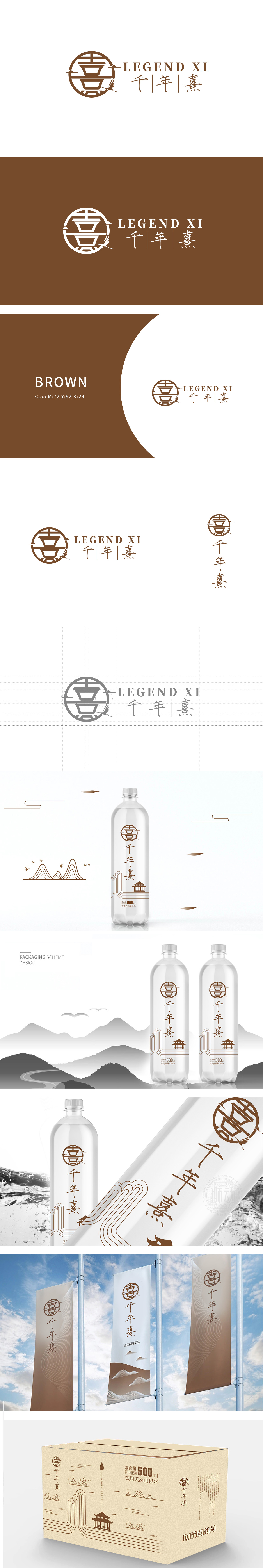
狮动设计以青铜礼器(如鼎、豆形器) 为原型,通过几何线条简化为上下叠加的“层叠结构”,既保留了传统器物的庄重感,又通过直线与折线的切割形成现代极简风格。外层环绕的圆环与内部“十”字分割,暗合中式美学中的“天圆地方”与“九宫格”布局,传递平衡、稳定的视觉感受,呼应“千年”的品牌历史感。仙鹤、远山的意境融入,强化“自然与祥瑞”,整体采用深棕+浅棕的单色系配色,深棕象征“土地、历史、沉稳”,呼应“千年”的厚重感;为矿泉水品牌赋予了“不止于水,更是东方生活美学载体”的差异化定位。
Lion design is based on bronze ritual vessels (such as ding and bean-shaped vessels), and simplified into a "layered structure" by geometric lines, which not only retains the solemn sense of traditional vessels, but also forms a modern minimalist style by cutting straight lines and broken lines. The circular ring surrounded by the outer layer is separated from the internal "ten", which coincides with the layout of "heaven and earth" and "nine squares" in Chinese aesthetics, conveying a balanced and stable visual experience and echoing the brand history of "Millennium". The artistic conception of cranes and distant mountains is integrated, and "nature and auspiciousness" are strengthened.s a whole, the monochromatic color scheme of dark brown and light brown is adopted.


扫码或拨打添加客服微信


