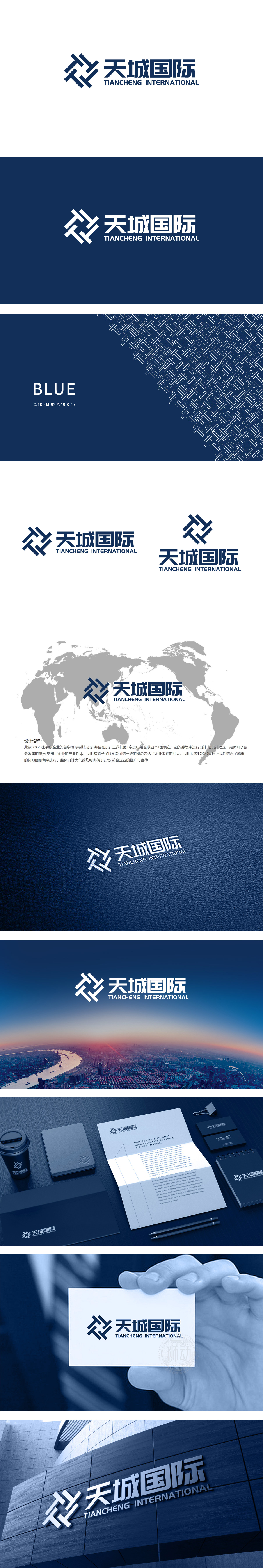
狮动设计以首字母“T”为设计原点,通过四个“T”字形元素的交叉环绕,形成类似“编织”或“齿轮咬合”的抽象图形。交叉线条可视为城市道路、建筑轮廓的抽象简化,既呼应“天城”名称中的“城”字,又将“国际”的宏观视野与“城市”的微观载体巧妙结合,形成“全球视野+本土根基”的双重意象。通过“交叉环绕”的图形语言传递“团结”“聚集”的价值观,深蓝与灰色的配色则强化了“可靠”“专业”的信任感,符合国际企业的品牌气质,这种设计既保留了字母的识别性,又通过重复与叠加强化了“聚集”“联结”的概念,直观呼应“国际”属性中“多元协作”的内涵。
Lion design takes the initial letter "T" as the design origin, and forms an abstract figure similar to "weaving" or "gear meshing" through the intersection of four T-shaped elements. Cross lines can be regarded as abstract simplification of urban roads and architectural outlines, which not only echoes the word "city" in the name of "Tiancheng", but also skillfully combines the macro vision of "international" with the micro carrier of "city" to form the dual image of "global vision+local foundation". Through the graphic language of "cross-surrounding", the values of "unity" and "gathering" are conveyed, and the color matching of dark blue and gray strengthens the trust of "reliability" and "professionalism".


扫码或拨打添加客服微信


