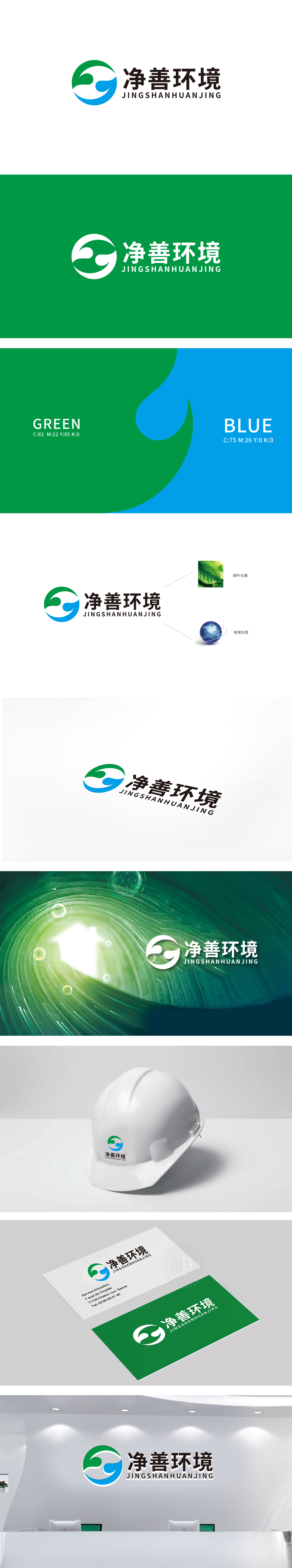
狮动设计以绿色(象征自然、生机)和蓝色(象征水、纯净)的抽象图形构成,整体呈循环流动的形态:绿色部分似叶片舒展,又像环绕的双手,传递“守护自然”的意象;蓝色部分模拟水流或空气的流动感,呼应“净善”中“净化”的核心功能,两色交织成闭环,暗喻“人与自然和谐共生”及“资源循环利用”的环保理念,线条流畅无棱角,体现温和可持续的品牌调性。整体将“环保”从抽象概念转化为可感知的视觉语言。既突出了品牌“净化环境”的核心业务,又传递了“守护地球、共建可持续未来”的深层价值。
Lion design is composed of green (symbolizing nature and vitality) and blue (symbolizing water and purity) abstract graphics, and the whole design is in a circular flow form: the green part stretches like a leaf, but also like surrounding hands, conveying the image of "protecting nature"; The blue part simulates the flowing feeling of water or air, echoing the core function of "purification" in "purity and goodness". The two colors interweave into a closed loop, implying the environmental protection concepts of "harmonious coexistence between man and nature" and "recycling of resources", with smooth lines and no edges and corners, reflecting the moderate and sustainable brand tonality.


扫码或拨打添加客服微信


