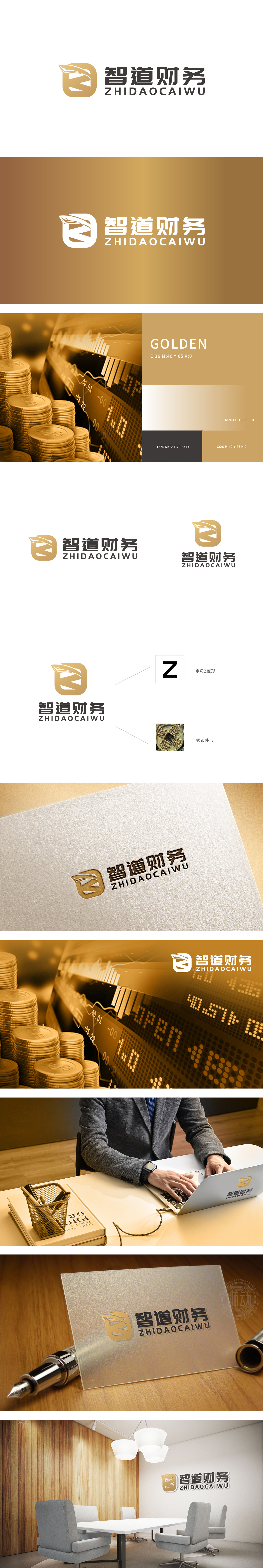
狮动设计以 “字母Z变形” 为核心骨架,“Z”的折线感:既象征财务数据的动态变化,也暗含“智慧分析”中的逻辑链条,符合财务咨询“通过数据洞察提供路径”的核心价值。钱币轮廓的隐喻:既呼应了中国传统钱币的经典形态(外圆内方,象征“规矩”与“流通”),又通过金色调强化“财富管理”的行业属性,传递“专业守护资产”的信任感。整体设计将传统钱币元素抽象化,既保留“财富”的文化联想,又通过几何形态与现代审美接轨,平衡“传统金融”与“智慧创新”的品牌定位。
Lion design takes "the letter Z deformation" as the core skeleton, and the sense of broken line of "Z" not only symbolizes the dynamic change of financial data, but also implies the logical chain in "intelligent analysis", which is in line with the core value of financial consultation "providing paths through data insight". Metaphor of coin outline: It not only echoes the classic form of traditional coins in China.(the outer circle is inside, symbolizing "rules" and "circulation"), but also strengthens the industry attribute of "wealth management" through the golden tone and conveys the trust of "professional guarding assets".


扫码或拨打添加客服微信


