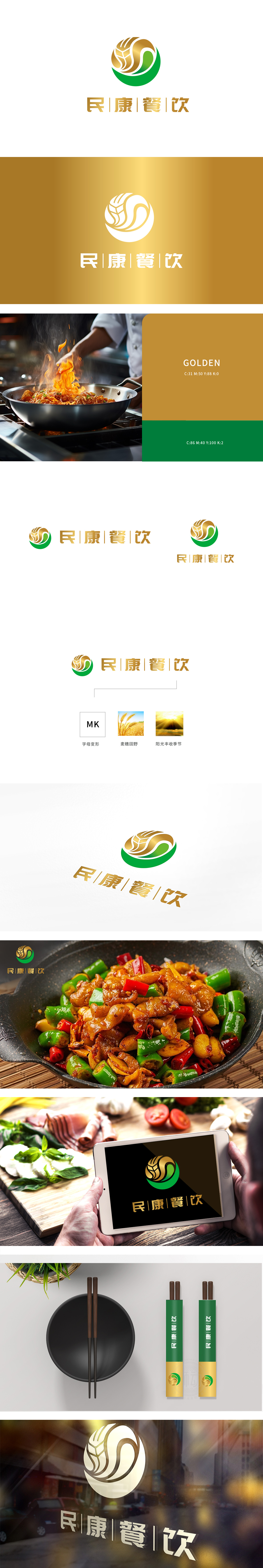
狮动设计以金色麦穗为核心视觉符号,直接关联餐饮行业的“食材源头”,传递“从田间到餐桌”的天然感,符合消费者对“安全、质朴、原生态”的餐饮需求。麦穗的环绕造型与绿色弧形结合,既像“守护”的意象,又形成闭环结构,象征品牌的完整性与可靠性,强化了亲和力。金色调(麦穗、阳光)传递温暖、饱满的情绪,符合餐饮品牌希望带给消费者的“满足感”和“烟火气”。民康餐饮”通过自然符号(麦穗)+ 价值色彩(金/绿),将“大众餐饮”的亲民属性、“健康安全”的核心卖点,以及“自然食材”的差异化优势浓缩于视觉中,图形符号与餐饮行业的深度绑定。
Lion design takes golden ears of wheat as the core visual symbol, which is directly related to the "source of ingredients" in the catering industry and conveys the natural feeling of "from field to table", which meets the consumer's demand for "safe, simple and original ecology" catering. The combination of the surrounding shape of the wheat ear and the green arc not only resembles the image of "guarding", but also forms a closed-loop structure, symbolizing the integrity and reliability of the brand and strengthening the affinity. Golden tones (ears of wheat and sunshine) convey warm and full emotions.


扫码或拨打添加客服微信


