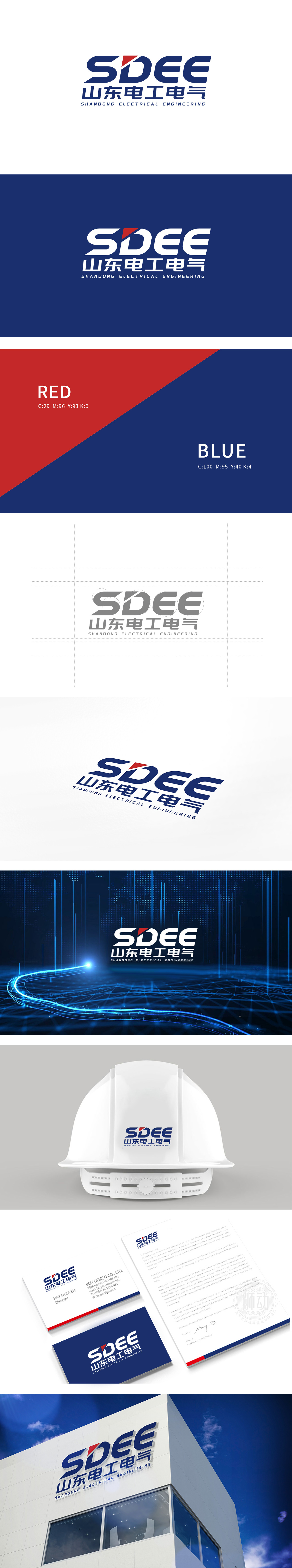
狮动设计以动态与能源属性的隐喻,嵌入“S”与“D”之间的红色锐角图形,形似箭头或能量爆发的顶点,既增强了视觉冲击力,又象征能源的高效、突破与科技驱动,红色在能源领域常关联动力与活力,“S”的流线型笔触,线条舒展且富有张力,既像电流的流动轨迹,又似能源传输的动态感,暗合电气行业“能量流动”的核心属性。企业名称笔画加粗、竖画挺直,体现企业扎根山东的地域厚重感和行业领军者的实力,标志通过“动态图形隐喻能源流动”“工业感字型强化专业属性”“色彩与结构传递科技与稳健”,将电气行业的“能量、科技、工业、可靠”等核心特质融入视觉设计,实现了“专业性”与“识别度”的高效平衡。
Liondesign uses the metaphor of dynamic and energy attributes, and embeds the red acute angle figure between "S" and "D", which looks like an arrow or the apex of energy explosion. It not only enhances the visual impact, but also symbolizes the high efficiency, breakthrough and technological drive of energy. Red is often associated with power and vitality in the energy field. The streamlined strokes of "S" are stretched and full of tension, which is not only like the flow track of current, but also like the dynamic sense of energy transmission, which coincides with the electrical industry. The bold strokes and straight vertical drawings of the enterprise name reflect the regional heaviness of the enterprise rooted in Shandong and the strength of the industry leader.


扫码或拨打添加客服微信


