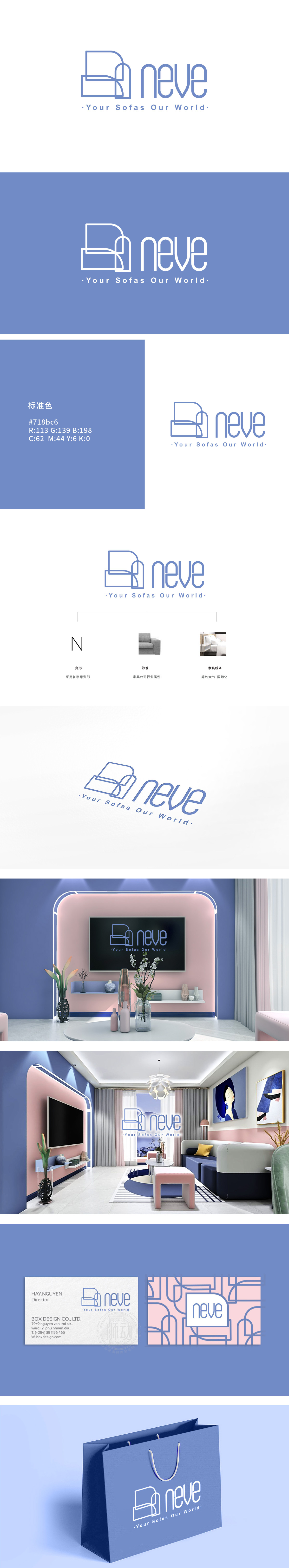
狮动设计以“沙发”为核心的符号化表达,传递家居产品的功能性与舒适感,极简线条勾勒产品形态 ,抽象还原了沙发的核心结构:线条利落却不失柔和,既体现家居设计的“结构化”,又暗含“舒适感”,符合沙发作为“家居核心单品”的功能定位。低饱和蓝调,强化“宁静、宜居”的品牌调性 ,字体与图形统一采用浅蓝/雾霾蓝色系,冷色调中带有柔和灰度,又传递“清新、宁静、高品质”的品牌联想。整体用符号传递“家的温度”,“neve”的设计精准抓住了家居行业的核心诉求:用“可感知的符号”传递产品功能,用“有温度的字体”(圆柔线条、低饱和色)唤醒情感共鸣。整体风格克制而不失细节,如同优质的家居产品本身——以结构支撑功能,以设计提升体验,最终让“品牌视觉”成为“家的一部分”。
Lion design takes "sofa" as the symbolic expression, which conveys the functionality and comfort of home products, outlines the product form with minimalist lines, and abstractly restores the core structure of sofa: the lines are neat but soft, which not only reflects the "structure" of home design, but also implies "comfort", which conforms to the functional positioning of sofa as a "home core item". Low saturation blues strengthen the brand tonality of "quiet and livable". The fonts and graphics are in light blue/haze blue system, with soft gray in the cool tone, and convey the brand association of "fresh, quiet and high quality". Symbols convey the "home temperature" as a whole, and the design of "neve" accurately captures the core demands of the home.


扫码或拨打添加客服微信


