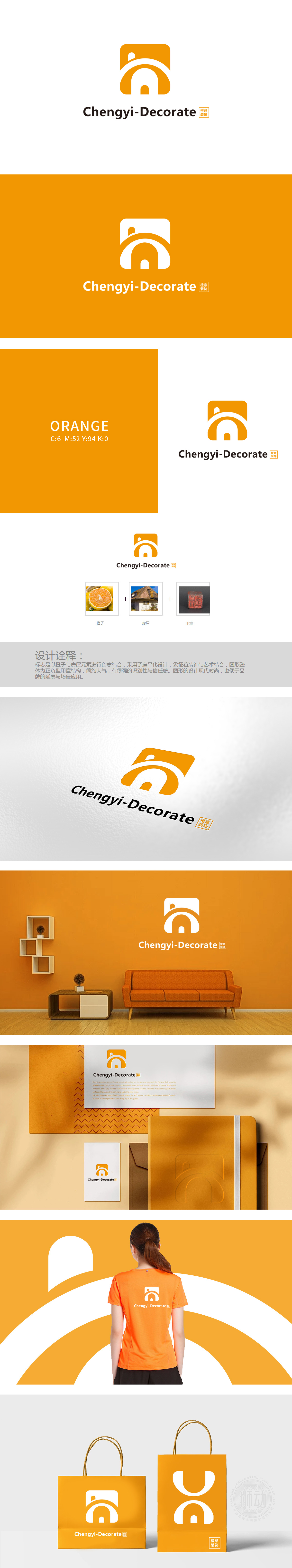
狮动设计通过橙色方形图标中,“房屋轮廓”作为核心识别符号,被置于视觉中心,直接关联“装饰”的行业属性;方形外框与房屋顶部的小凸起(类似烟囱或屋檐细节),既强化了“家”的安全感,又通过橙色传递温暖、活力的品牌调性。整体通过“橙子(情感联想)+ 房屋(功能联想)+ 印章(信任联想)”的三重符号锚定**,既解决了“行业识别”(房屋)、“品牌记忆”(橙色与具象元素),又通过文化符号(印章)提升了差异化竞争力,实现了“商业需求”与“美学表达”的高效统一。
In the orange square icon of Lion Design, "house outline" as the core identification symbol is placed in the visual center and directly related to the industry attribute of "decoration"; The square frame and the small protrusions on the top of the house (similar to chimney or eaves details) not only strengthen the sense of security of "home", but also convey the warmth and vitality of the brand tonality through orange. As a whole, it is anchored by the triple symbol of "orange (emotional association)+house (functional association)+seal (trust association)", which not only solves the problems of "industry identification" (house) and "brand memory" (orange and figurative elements).


扫码或拨打添加客服微信


