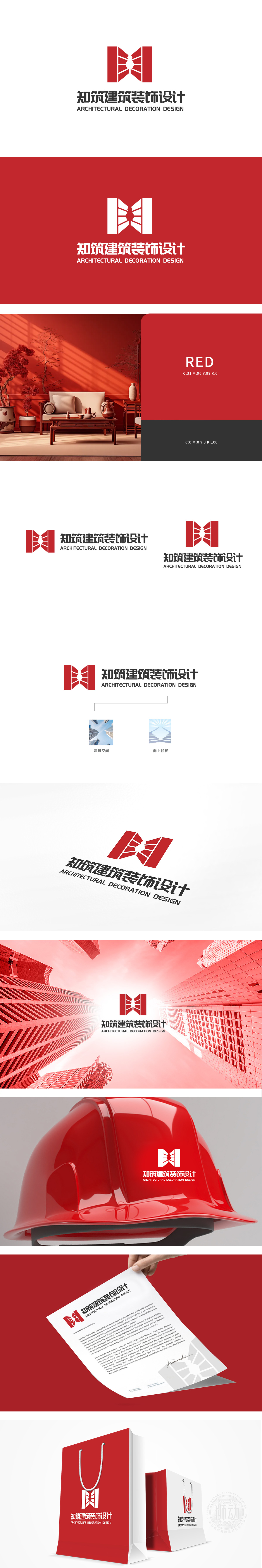
狮动设计由左右对称的“M”形结构与中心放射状线条组成。整体呈“山”字形或“建筑框架”形态,直观关联“建筑”行业属性;中心的白色放射线条模拟光线穿透建筑结构的视觉效果,既象征空间的通透感,又暗含“设计赋能空间”的理念。大面积正红色传递专业、活力与信任感,符合建筑行业对“稳固”与“创新”的双重诉求,整体通过“建筑框架”“光线”“阶梯”等符号,将“专业能力”(设计)与“品牌愿景”(成长)融入视觉,既体现建筑设计的“专业严谨”,又传递“用设计创造向上空间”的品牌理念。
Lion design consists of symmetrical "M" shape structure and central radial line. The whole is in the shape of "mountain" or "architectural framework", which is directly related to the industry attribute of "architecture"; The white radiation line in the center simulates the visual effect of light penetrating the building structure, which not only symbolizes the sense of space transparency, but also implies the concept of "designing empowering space". A large area of true red conveys professionalism, vitality and trust, which is in line with the dual demands of the construction industry for "stability" .


扫码或拨打添加客服微信


