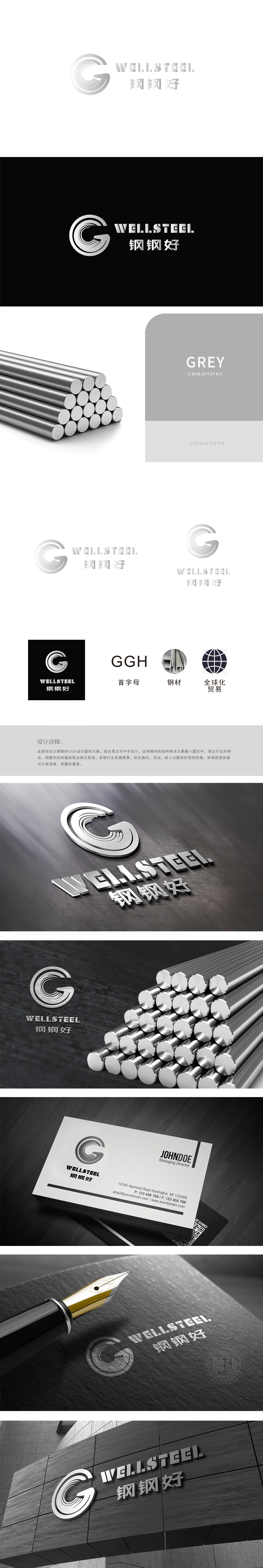
狮动团队以“G”为骨,构建品牌记忆点,外层粗线条象征钢材的坚硬质感,内层螺旋线条则打破静态,赋予标志“锻造”“流动”的动态联想,暗合钢铁从原料到成品的加工过程,也隐喻企业“精益求精、持续发展”的理念。色彩策略:黑底白图的高对比配色,既符合工业领域沉稳、专业的调性,两个“G”字母相互环绕、咬合,如同齿轮般紧密协作,直观体现“合作共赢”的理念,这与贸易行业“连接供需、共享资源”的本质高度契合。直线条与曲线过渡结合,打破工业品牌常见的“冰冷刻板”印象,传递“专业可靠,且灵活应变”的品牌性格。
Lion Taking "G" as the bone, the brand memory point is constructed, the outer thick line symbolizes the hard texture of steel, while the inner spiral line breaks the static state, giving the symbol "forging" and "flowing" a dynamic association, which coincides with the processing process of steel from raw materials to finished products, and also symbolizes the concept of "Excellence and sustainable development" of enterprises. Color strategy: The high contrast color matching of white pictures with black background not only conforms to the calm and professional.


扫码或拨打添加客服微信


