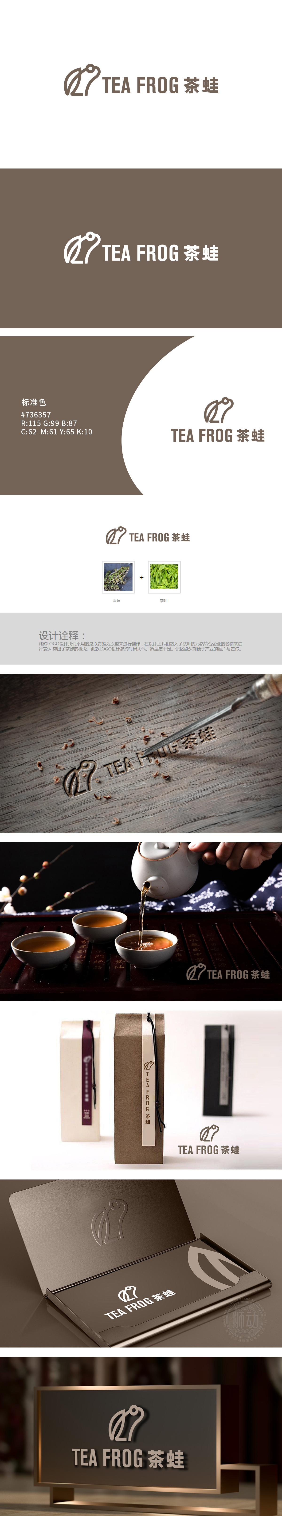
狮动设计以极简笔触勾勒出中式茶饮的灵魂意象:线条如蜷曲的茶叶舒展,轮廓似青蛙蓄势待发,浅棕墨色如茶汤沉淀,将“茶”的温润与“蛙”的灵动揉为一体。这不只是元素的叠加,更是中式美学“虚实相生”的精妙演绎:青蛙的动态藏于静态线条,茶叶的形态隐于生物轮廓,恰似中国茶道“一期一会”的哲思——于方寸图形中,见自然生趣,闻茶香禅意。
Lion design outlines the soul image of Chinese tea with minimalist strokes: the lines stretch like curled tea leaves, the outline is like frogs ready to go, and the light brown ink color is like tea soup precipitation, which combines the warmth of "tea" with the agility of "frog". This is not only the superposition of elements, but also the subtle interpretation of Chinese aesthetics: the frog's dynamics are hidden in static lines, and the tea's shape is hidden in the biological outline.


扫码或拨打添加客服微信


