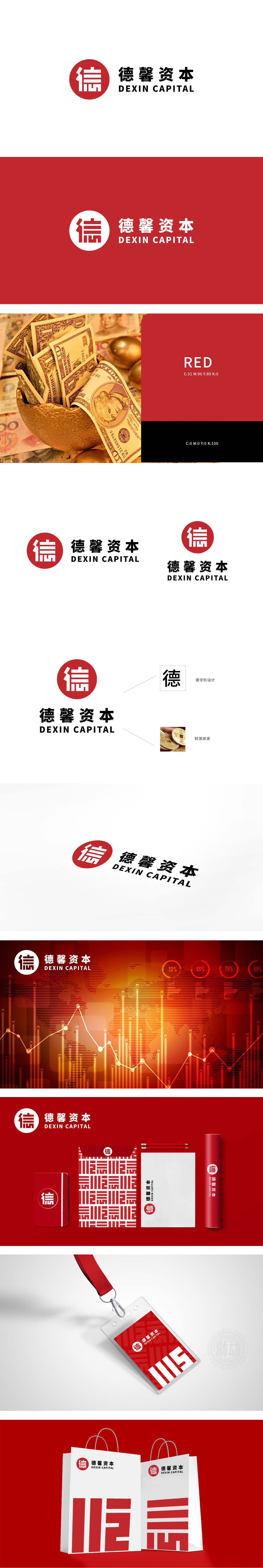
狮动设计采用“信”字印章的文化与信任隐喻,“信”字直接点明“诚信”“信任”的核心价值观,印章造型,既传递出品牌对传统文化的尊重,又通过历史符号的厚重感提升权威性。“信”字采用几何化处理,笔画棱角分明,更符合现代金融品牌简洁、理性的视觉语言;圆形外框象征“圆满”“全球化”,同时形成封闭边界,增强视觉聚焦,在金融领域,红色也常与“增长”“价值”关联(如股市上涨信号),间接强化投资回报的正向联想。整体设计既有“中国身份”的文化自信,又符合国际金融品牌的视觉规范,堪称“传统元素现代化应用”与“行业属性精准表达”的典范。
Lion esign adopts the cultural and trust metaphor of "Xin" seal. The word "Xin" directly points out the core values of "honesty" and "trust", and the seal shape not only conveys the brand's respect for traditional culture, but also enhances its authority through the heavy sense of historical symbols. The word "Xin" adopts geometric processing, and the strokes are angular, which is more in line with the concise and rational visual language of modern financial brands; The circular frame symbolizes "perfection" and "globalization", at the same time, it forms a closed boundary and enhances visual focus. In the financial field.


扫码或拨打添加客服微信


